The new brand identity was created by another designer while I worked on the product; I applied it across the app.
Case study 02 · Business marketplace
16Bags
Making it easier to buy, sell and lease existing businesses in Africa.
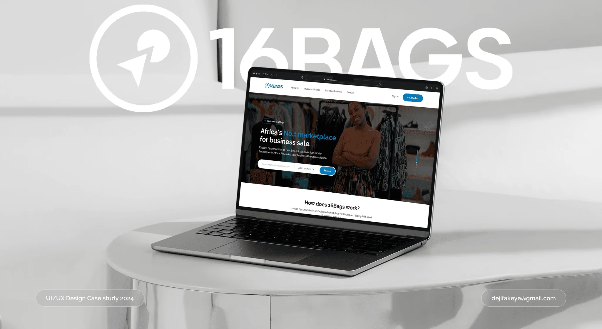
16Bags is a marketplace where owners list businesses for sale or lease and entrepreneurs acquire them. I redesigned the web app end to end, from a dated first version into the product the company now pitches to investors, across discovery, listings, seller onboarding, verification, dashboards, messaging and admin.
The challenge
Redesign a business marketplace where difficult navigation, weak mobile layouts and unclear listing flows affected usability and trust.
My contribution
I led the research and redesigned the public pages, buyer and seller journeys, dashboards, messaging and admin experience.
Key decision
Give buyers enough information to assess an opportunity while protecting sensitive seller details behind verification.
Outcome & status
Launched at 16bags.com after testing with ten participants. The redesign was also featured in the company’s September 2024 investor pitch deck.
(01)Overview
Good businesses shouldn’t close just because the owner wants out.
Across Africa, viable businesses shut down because of owner fatigue, debt or a gap in leadership. At the same time, new founders start from scratch and most of their ventures fail. 16Bags connects the two: owners who want to exit, and entrepreneurs who would rather buy something that already works.
39.6m
MSMEs in Nigeria, more than in the UK and US
80%
of them fail within their first five years
34%
of the next generation are interested in, and equipped for, taking over a family business
2
use cases: owners planning an exit, and businesses expanding into new markets
Figures from the 16Bags pitch deck, September 2024.
One marketplace, three sides. Each needed its own path through the product.
- SellerExit, retire or move on: list the business, prove it is real and follow its review.
- BuyerGrow or enter a new market: search, compare, verify and contact the owner.
- AdminReview submissions and manage businesses, users and permissions.
(02)Starting point
The first version, and why it wasn’t working.
16Bags already had a live product with a neo-brutalist look. Before designing anything, I ran a heuristic review of it and compared what I found with what users told me.
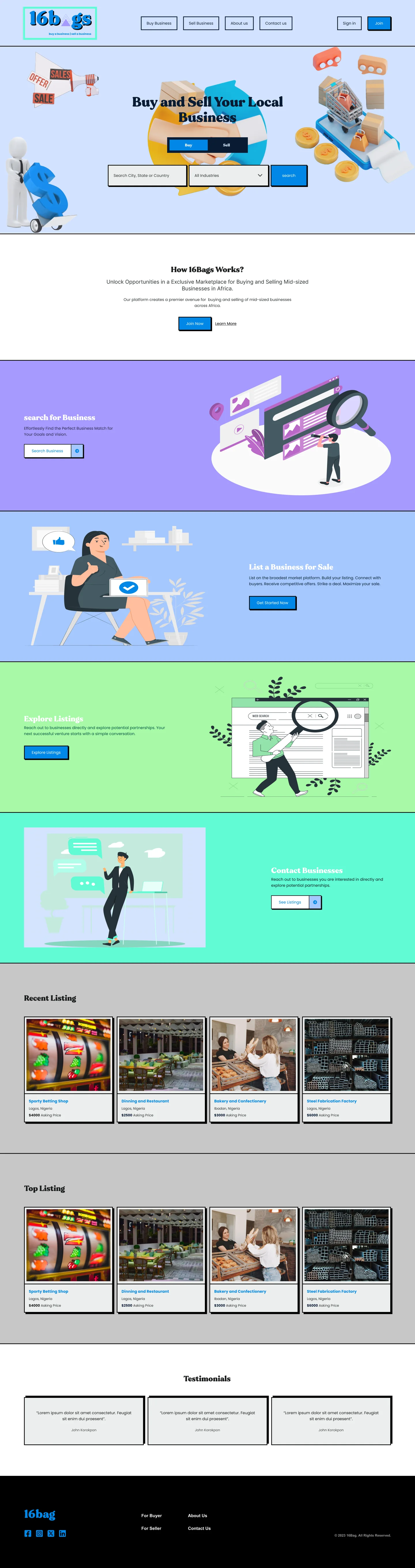
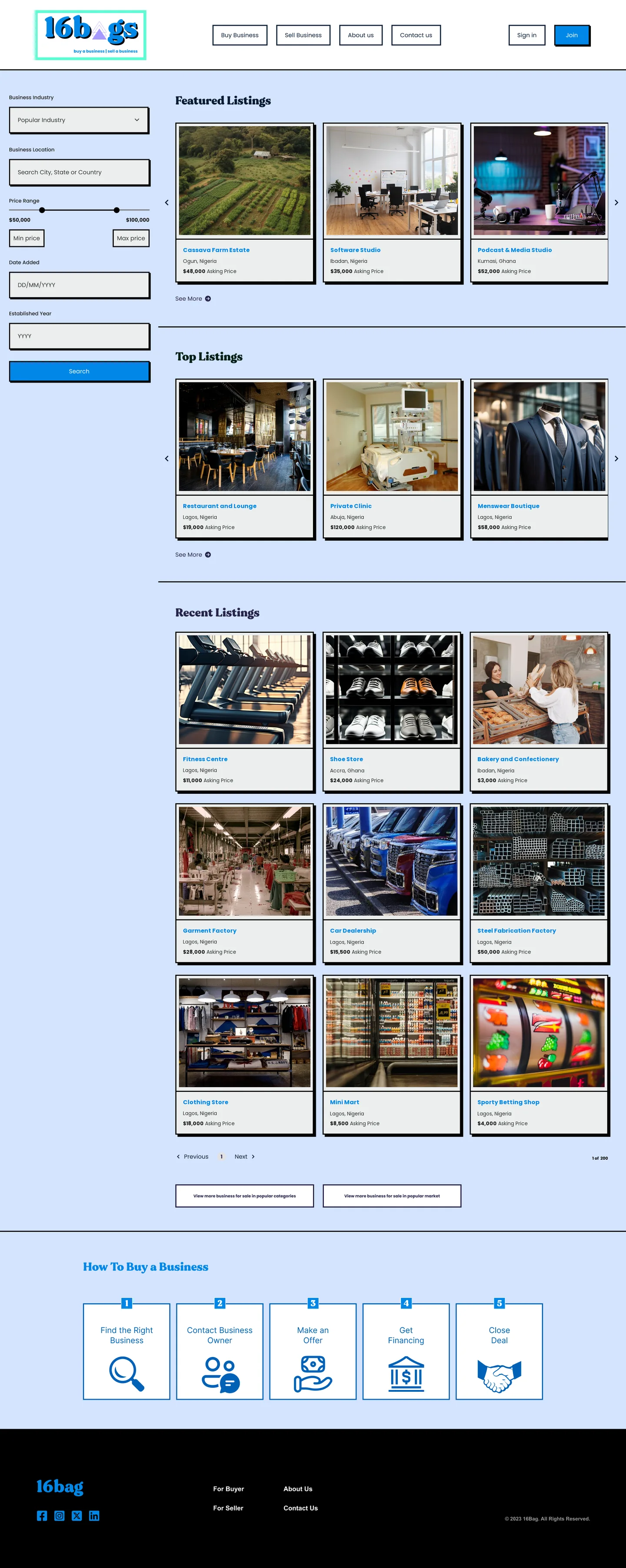
Hover over a page to scroll through it. The placeholder photos in the original file have been swapped for real business photos.
A style that worked against trust
Thick black borders, hard drop shadows, candy-coloured sections and stock 3D illustrations. In interviews, people described it as outdated and said it made them doubt the platform.
A brand that kept changing its name
The logo read “16b▲gs”, the footer said “16bag” and the copyright said “16Bag”. Small, but it chips away at credibility on a site that handles business sales.
Listings that all looked alike
Cards showed a name, a city and a price, but not the industry or whether the business was for sale or lease, so buyers had to open each one.
Sensitive details open to everyone
A listing page showed the business name, revenue, staff count, facilities and the owner’s name to any visitor, with no check on who was looking.
One long form, then silence
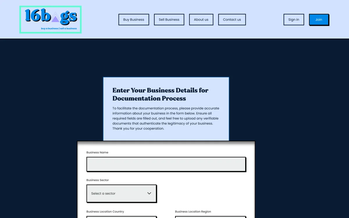
Selling meant a single dense form of business, contact and document fields, with no idea of what happened after Submit.
Hard to use on a phone
Interviewees said the site was close to unusable on mobile, with slow loads and broken layouts.
(03)Research
Listening to both sides of the deal.
I interviewed 15 people who had used 16Bags to list or look for a business. I asked how they listed a business, what got in the way when they searched, what they thought of the design, and how the site worked on their phone.
15
buyer and seller interviews
4
core questions on listing, search, design and mobile
5
competing marketplaces reviewed
10
participants in usability testing
People couldn’t find the main features.
Navigation was the most common complaint, and some people gave up on a task halfway through.
The design cost the platform trust.
People felt the dated look made 16Bags seem unprofessional, which matters when you are about to share your business’s finances.
Mobile barely worked.
Many people tried the site on their phones and ran into slow pages and broken layouts.
Failing at a task felt bad.
People described frustration, disappointment and anxiety when they couldn’t finish what they came to do.
Two people we designed for

Seller · Accra, GhanaInterview-based
Kwame, 42
Goal: Sell his retail business quickly, at a fair price, to someone who will keep it running.
Needs
Clear guidance on preparing a business for sale, and a platform that attracts serious buyers.
Key friction
He couldn’t find his way around the old site to list his business, and he worried about who would see his details.

Buyer · Lagos, NigeriaInterview-based
Amina, 35
Goal: Find a business that fits her investment criteria and quickly judge whether it is viable.
Needs
Filters that match her criteria and business information she can trust.
Key friction
She couldn’t filter properly, doubted the accuracy of listings and found the dated design hard to trust.
(04)Market
Learning from the platforms buyers already know.
I compared five business marketplaces. None of them focused on Africa, and most handled only online or tech businesses. That was the gap 16Bags could own. I also noted what each one did well that 16Bags could borrow.
| Platform | Strength | Weakness | What 16Bags took from it |
|---|---|---|---|
| BizBuySell | Detailed listings, high trust | Dated visuals, little emotional pull | Advanced filters |
| Flippa | Clean, modern and responsive | Doubts about listing authenticity | Mobile first, community features |
| BusinessForSale | Buyer guides and seller checklists | Cluttered homepage, weak mobile | Guidance inside the flow |
| Acquire.com | Verified, high-quality listings | Hard to switch between business types | Clear separation of business types |
| GetAcquired | Verified deals, in-depth listings | Key information is hard to find | Clean, scannable listing pages |
(05)How a deal works
Eight steps from listing to handover. The product owns the first four.
Selling a business doesn’t end with a button. It goes through an NDA, due diligence, a sale agreement and a transfer of ownership. I mapped the full deal with the founders, then scoped the product to the steps that happen on 16Bags: getting a verified listing in front of a serious buyer and starting the conversation.
On 16Bags
01ListThe owner submits the business and its documents.
02Verify16Bags checks the business meets its standards.
03Go liveThe listing appears for buyers.
04ConnectA buyer reviews the listing and contacts the owner.
With the buyer, seller and their advisers
05NDABoth parties sign a non-binding NDA.
06Due diligenceValuation and checks begin.
07AgreementA binding sale and purchase agreement is signed.
08ClosePayment, transfer of ownership, deal closed.
Making this split explicit kept the scope realistic. It also gave every screen a single job: help a step from 01 to 04 happen, with enough trust that step 05 is worth starting.
(06)Structure
A structure built around the two main jobs.
The old menu split the site into Buy Business, Sell Business, About and Contact, and much of each page was marketing copy. I organised the site around the two things people come to do, browsing listings and listing a business, and gave signed-in users a home of their own.
Before
Buy BusinessSell BusinessAbout usContact usSign inJoin
After
Business Listings
- Featured, Top and All listings
- Search and filters
- Listing detail
- Verification & subscription New
List Your Business
- Step 1 · Personal information
- Step 2 · Business information
- Step 3 · Supporting documents
- Submitted for review New
Account
- Sign up · Sign in
- Dashboard and my listings
- Messages New
- Subscription
Company
- About Us
- Contact
- Admin: reviews, users, roles New
(07)Discovery
From a marketing page to a marketplace.
The old homepage spent four full-width illustrated sections before showing a single business. The new one leads with search by country and industry, explains how listing and buying work, then shows real listings straight away.
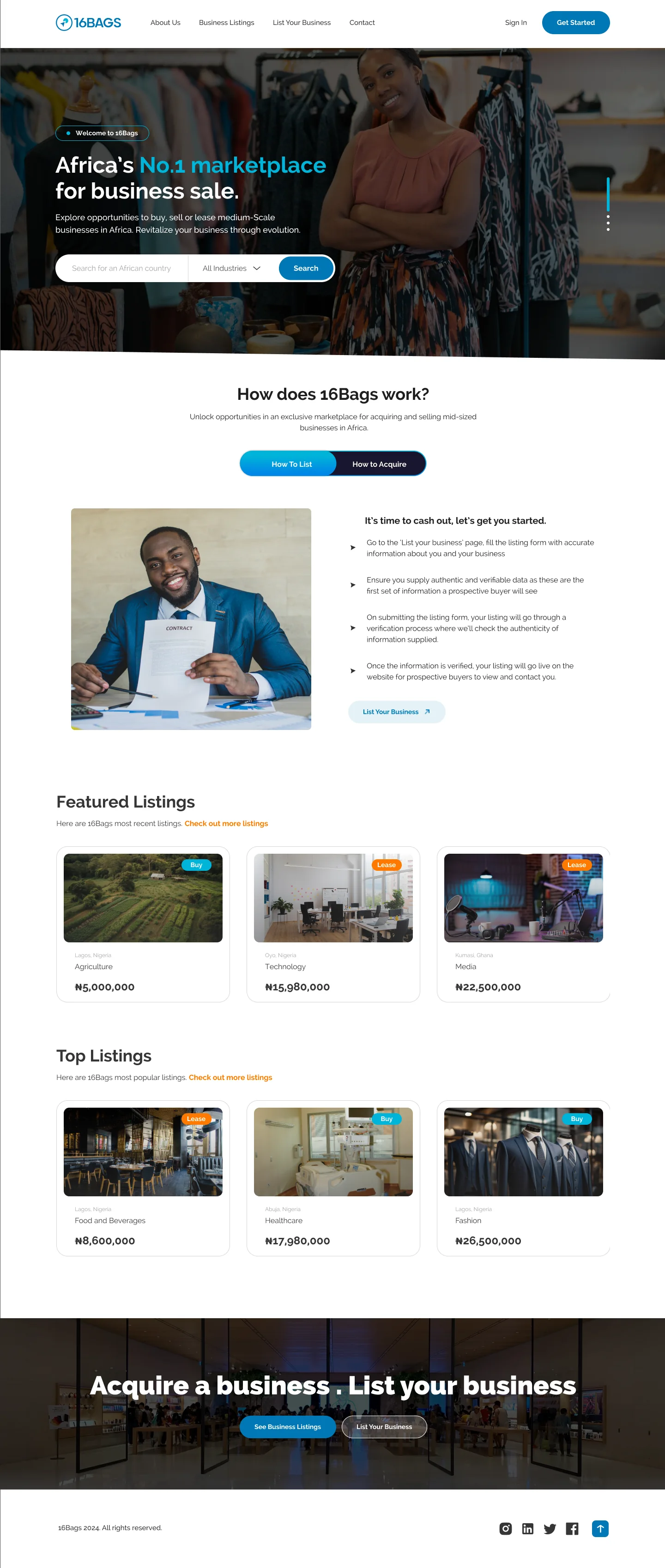
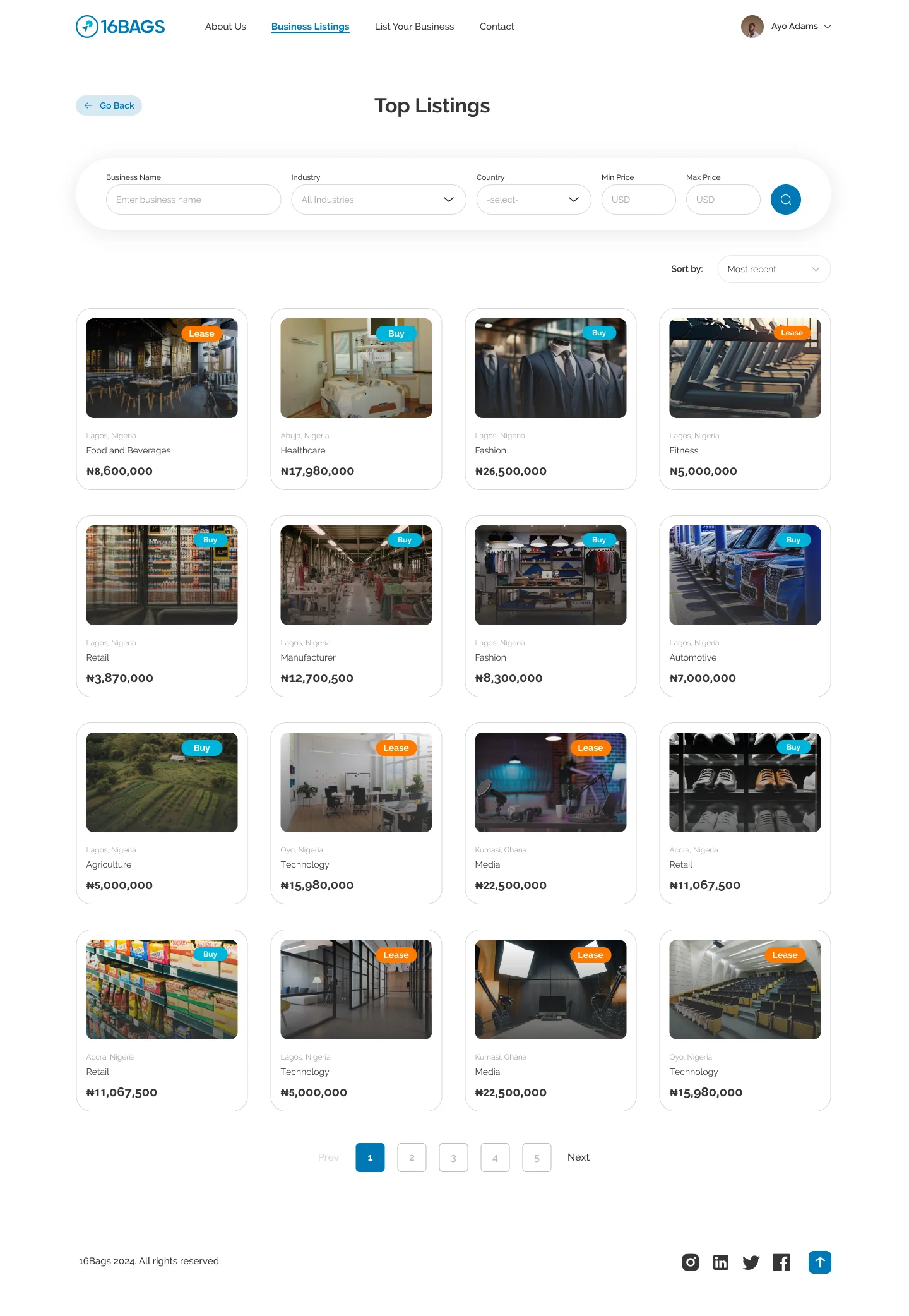
Hover over a page to scroll through it.
Search first
Country and industry search sits on the first screen, because that is how buyers in the interviews described starting.
Two ways in
A How to List / How to Acquire toggle explains each side of the marketplace in four short steps. The labels cover selling and leasing, a change that came out of testing, and neither side has to scroll past the other.
Real photos, not illustrations
The old site leaned on stock 3D illustrations. I used photos of real shops, farms, studios and factories so buyers can picture the business and the platform feels grounded.
Cards that answer first questions
Every card shows a real photo, a Buy or Lease badge, the industry, the location and the asking price, so buyers can narrow down before opening anything.
(08)Listing detail
Protect the seller, earn the buyer’s trust.
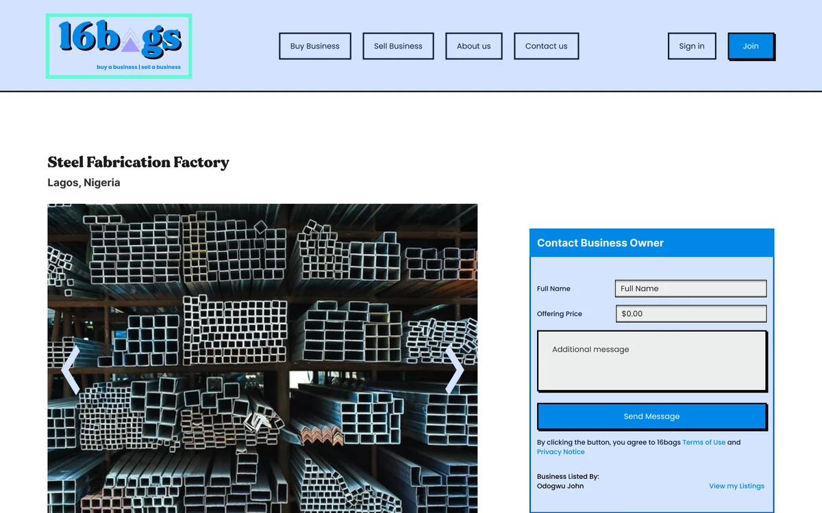
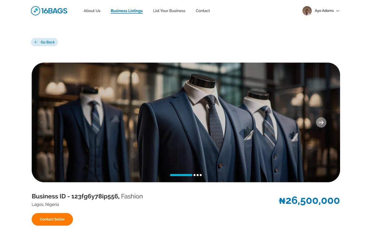
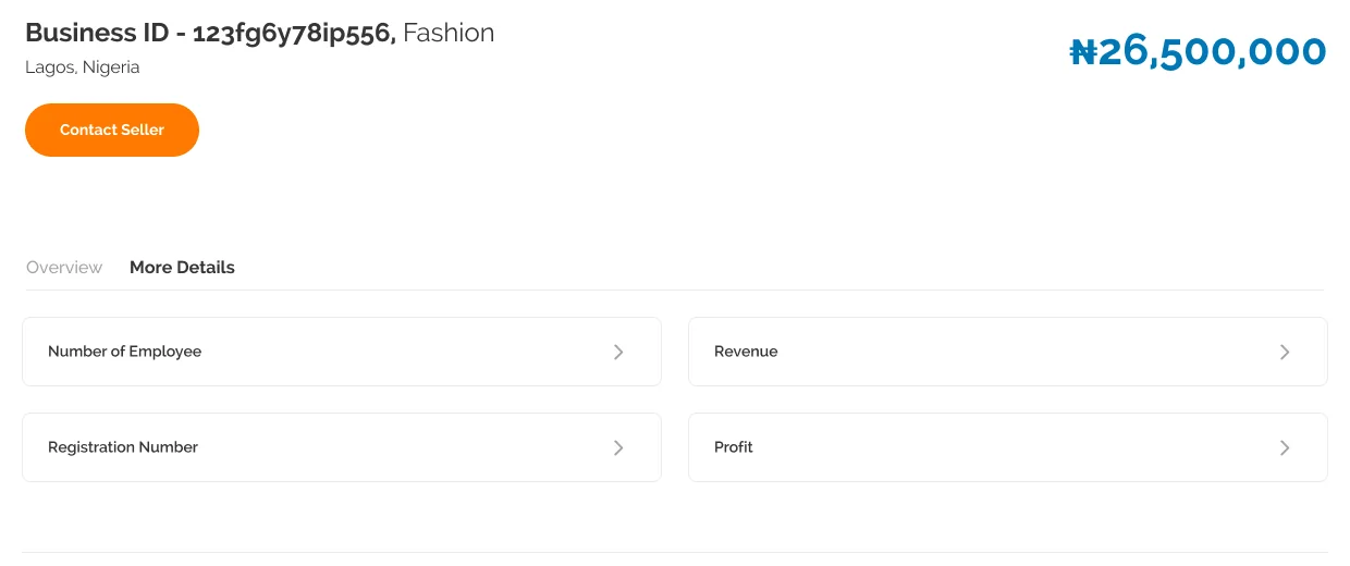
Owners need privacy until they know who is asking; buyers need enough detail to take a business seriously. The old page gave everything to everyone. The new one lets anyone see the basics, then asks for verification before showing the rest.
A listing anyone can judge
BeforeThe business name, owner’s name, revenue, staff and facilities were all public, and an enquiry form asked buyers to name an offer before they knew much.
AfterEach business has an ID instead of a name. The page shows photos, industry, location and a large asking price, with one Contact Seller action.
The business model, in the interface
Verification is what buyers pay for.
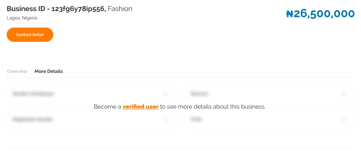
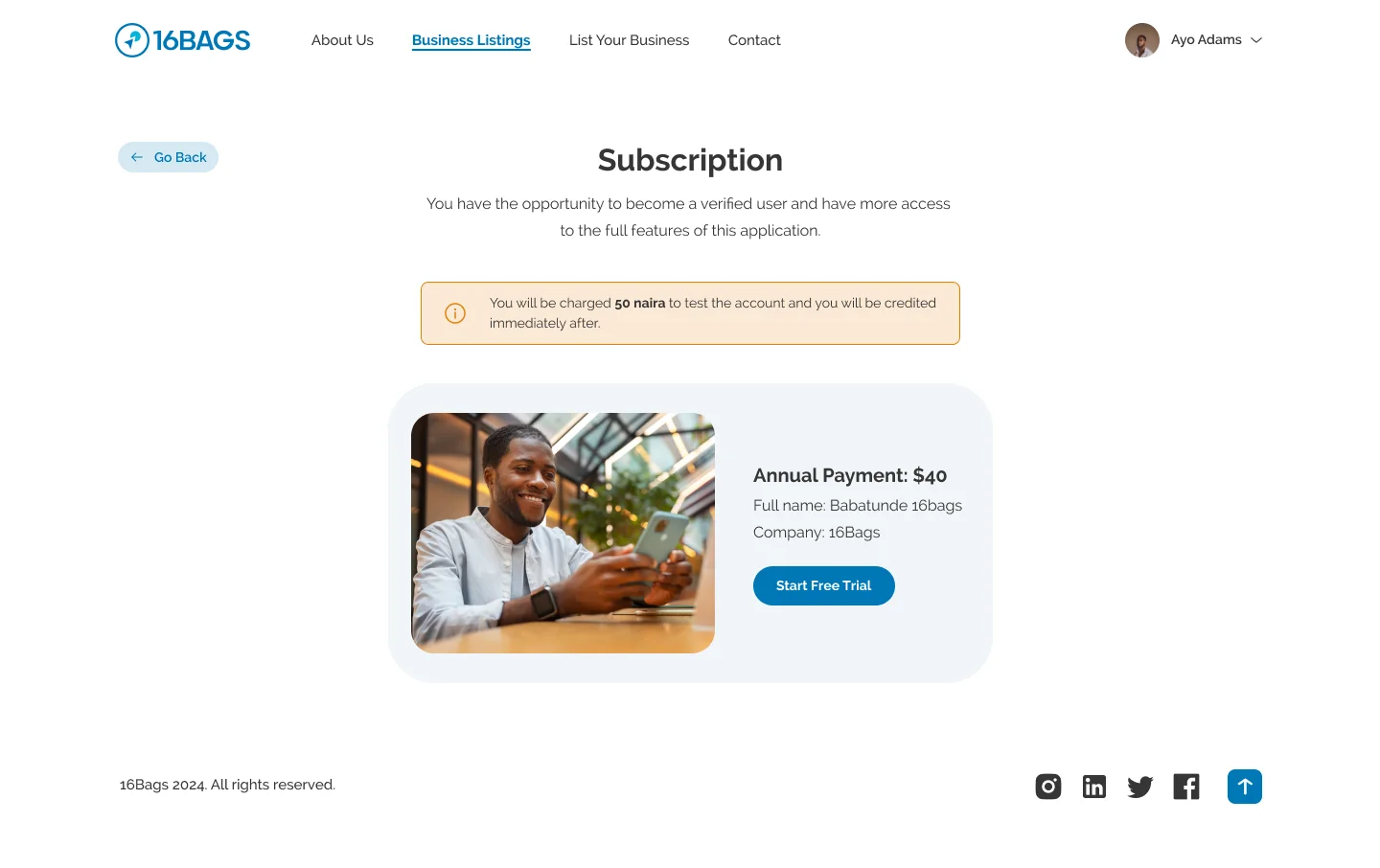
16Bags earns money by charging buyers to see full listing data and message owners. Instead of a paywall page, I put that value where buyers feel it: More Details shows the fields that exist (employees, revenue, registration number, profit), blurred, with one link to become a verified user.
Owners get privacy until someone has committed to the platform. Buyers can see what they would unlock before they pay.
Design decision
Show the shape of the hidden data rather than hiding the section. People decide faster when they can see what they would get.
(09)Seller journey
Make a substantial listing form manageable.
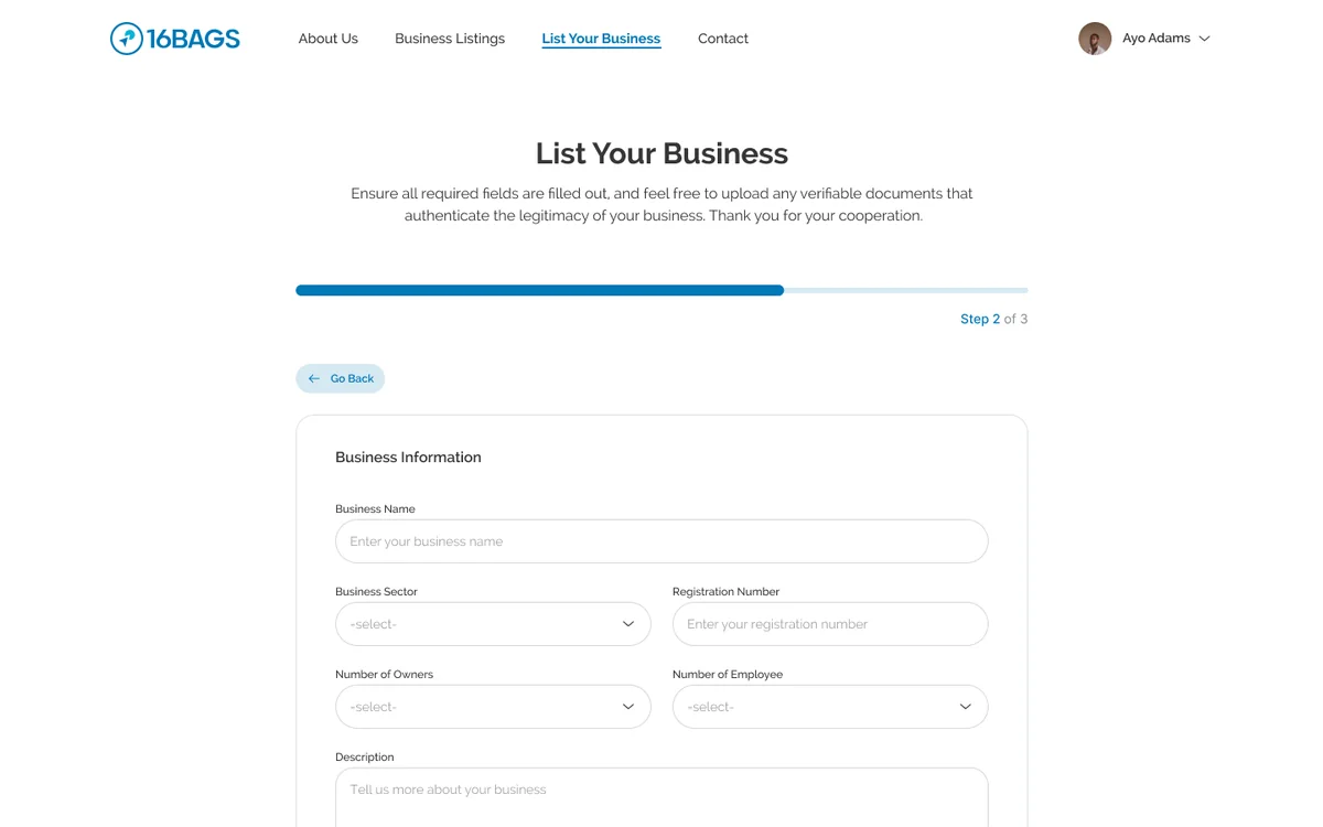
Selling a business calls for far more information than a classified ad. The old form put everything on one screen. I split it into three steps with a progress bar, explained why each step matters, and ended with a clear message that the listing goes to review.
Personal information
Contact details for the person submitting the business.
Business information
Sector, registration number, owners, staff, description, reason for selling, trailing revenue, location, asking price, revenue and profit.
Supporting documents
Business images and documents that help the team review the submission.
One form becomes three steps
BeforeTen mixed fields on a dark page, a native file input and a Submit button with nothing after it.
AfterGrouped fields, a progress bar with Step 2 of 3, a Go Back link, and a success screen that explains the review before the listing goes live.
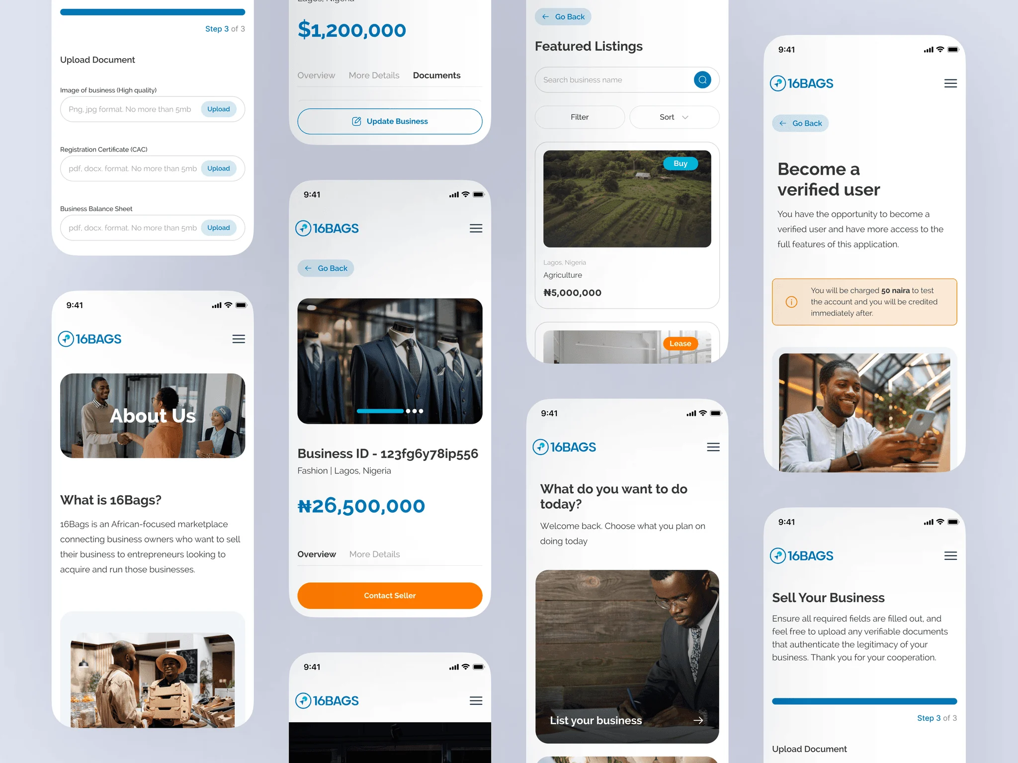
Submitting a listing is the start of a review, not the end of the process.
The designs tell sellers their information will be checked before the business appears publicly. That expectation connects the form to the admin workflow.
(10)Beyond the public pages
The marketplace needed its own operating tools.
The redesign included a user dashboard for managing listings, messaging for enquiries, and an admin area for reviewing businesses. These are part of the same experience: a submitted listing has a status, a buyer has questions, and the team needs control over what goes live.
Seller dashboard + messaging
Listing states, status filters, empty states and the conversation view: seller-side management and buyer–seller communication.
Admin review + permissions
The business management table and roles and permissions: listing approval, user management and role controls.
(11)Visual system
From neo-brutalist to calm and credible.
The first version relied on illustrations, hard black borders and offset shadows. I switched to real photography and carried the new brand, created by another designer, into the product: Raleway, a deeper blue, and soft rounded cards.
Before
Steel Fabrication FactoryLagos, Nigeria$50,000 Asking Price
MADE Gentle + Poppins · #0087E6 · 3px #000 border · 6px hard shadow
Primary#0077B6
Secondary#00B4D8
Orange#FF7A00
Deep navy#191630
Text#363636
Error / 600#D92D20
Gray / 300#D0D5DD
White#FFFFFF
Raleway
Heading · 32 BoldHow does 16Bags work?
Card title · 18 Bold16Bags, Energy
Question · 16 SemiBoldHow do we buy and sell business?
Body · 16 RegularBuy, sell or lease businesses across Africa.
Badge · 14 BoldLease
Pills and soft cards.
Buttons & badgesRadius 100
Listing cardsRadius 24 · image 12
AccordionsRadius 14–18
Card shadow0 5 16 · #080F34 6%
Open state2px #0077B6 border
Components
Segmented toggle
How To ListHow to Acquire
Buttons
CancelDelete
Accordion
How do we buy and sell business?
How do we buy and sell business?
Listings move through review before they go live, so every business you see has been checked first.
Listing card
 Lease$1,200,000
Lagos, Nigeria
16Bags, Energy
(12)Testing & outcome
Tested with the people who struggled first.
I ran usability tests with 10 participants from the original interview group. They searched for a business, submitted a listing and moved around the site on mobile. Most fixes were small: clearer labels and better button placement on the listing pages and the form. One finding changed the product itself.
Before
How to SellHow to Buy
After
How to ListHow to AcquireBuy / Lease badges
Testing added leasing to the marketplace.
The redesign was scoped for buying and selling. In testing, several participants asked about leasing a business instead, so we added it. Sell and Buy became List and Acquire, terms that cover both selling and leasing, and every listing now carries a Buy or Lease badge.
Clearer discovery
Search, filters, badges and detail pages help buyers move from a broad set of listings to a specific opportunity.
Privacy with a path to more
Business IDs and the verification gate protect owners while showing buyers exactly what they unlock.
Structured submission
A three-step form with progress and a review message makes listing a business feel manageable.
The face of the pitch
The redesigned screens became the product shown in 16Bags’ September 2024 investor pitch deck.
(13)Reflection & next steps
Trust has to be visible in the flow.
A polished interface helps a marketplace feel approachable, but trust here comes from the flow itself: what a buyer can see, what a seller is protected from, and what happens after each submit.
What I learned
Mapping the full deal changed how I designed the screens. Once it was clear the product only owned the first four steps, every page could focus on one outcome: a verified listing and a serious first conversation. The verification gate came out of that thinking. It serves the business model, the seller and the buyer at the same time.
What I would do next
- Add success stories and testimonials from completed deals, which interviewees said would build trust.
- Track where sellers pause or leave the three-step form, and which fields need better guidance.
- Measure how many buyers who reach the gate go on to verify, and test what the blurred preview shows.