A funded naira account
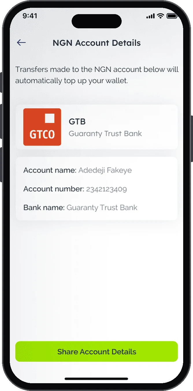
Proposed: fund the wallet by bank transfer to dedicated NGN account details.
Personal conceptUnfinished. A self-initiated project, not a shipped or client product.
Case study · Personal finance & payments
BracketPay is a personal fintech concept exploring budgeting, currency exchange and payments in one app. The proposed experience brings account funding, currency swaps, virtual cards and spending plans together.
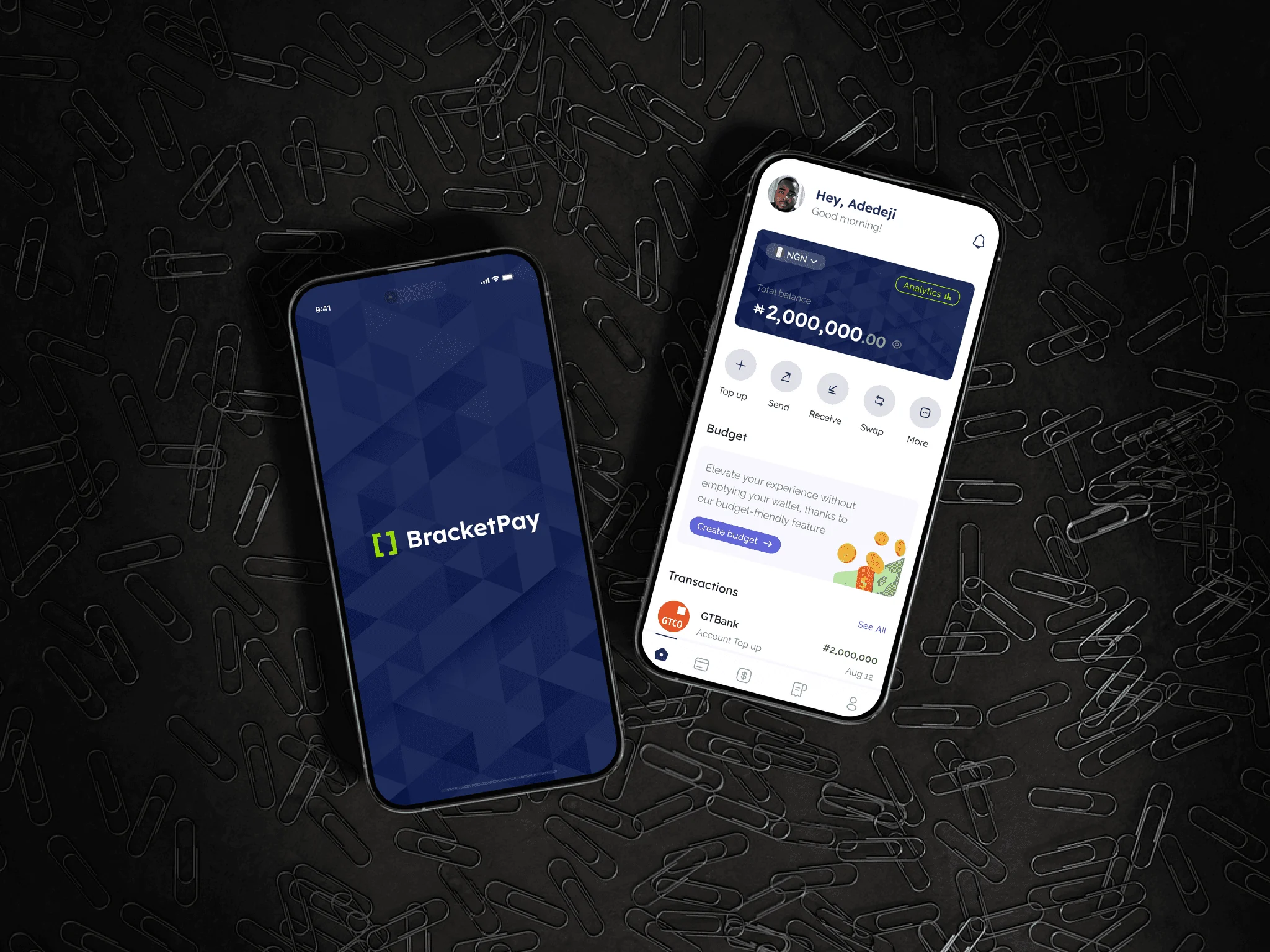
Explore how budgeting, currency exchange and payments could work together in one mobile experience.
I developed the product concept and designed its initial interfaces independently.
Show transaction amounts, exchange rates and fees before confirmation, with budgeting accessible from the same account.
I completed concept designs for the core flows: funding, currency swaps, virtual cards, transfers and budgets. None of the services were built, and the designs have not been tested with users.
These four services usually sit in separate apps. In BracketPay, each one is a tap from the home screen.
Proposed: fund the wallet by bank transfer to dedicated NGN account details.
Convert between naira and other currencies with the rate and fee shown upfront.
Proposed: a card for international online payments, with fees still to be confirmed.
Set budgets and track what is left to spend.
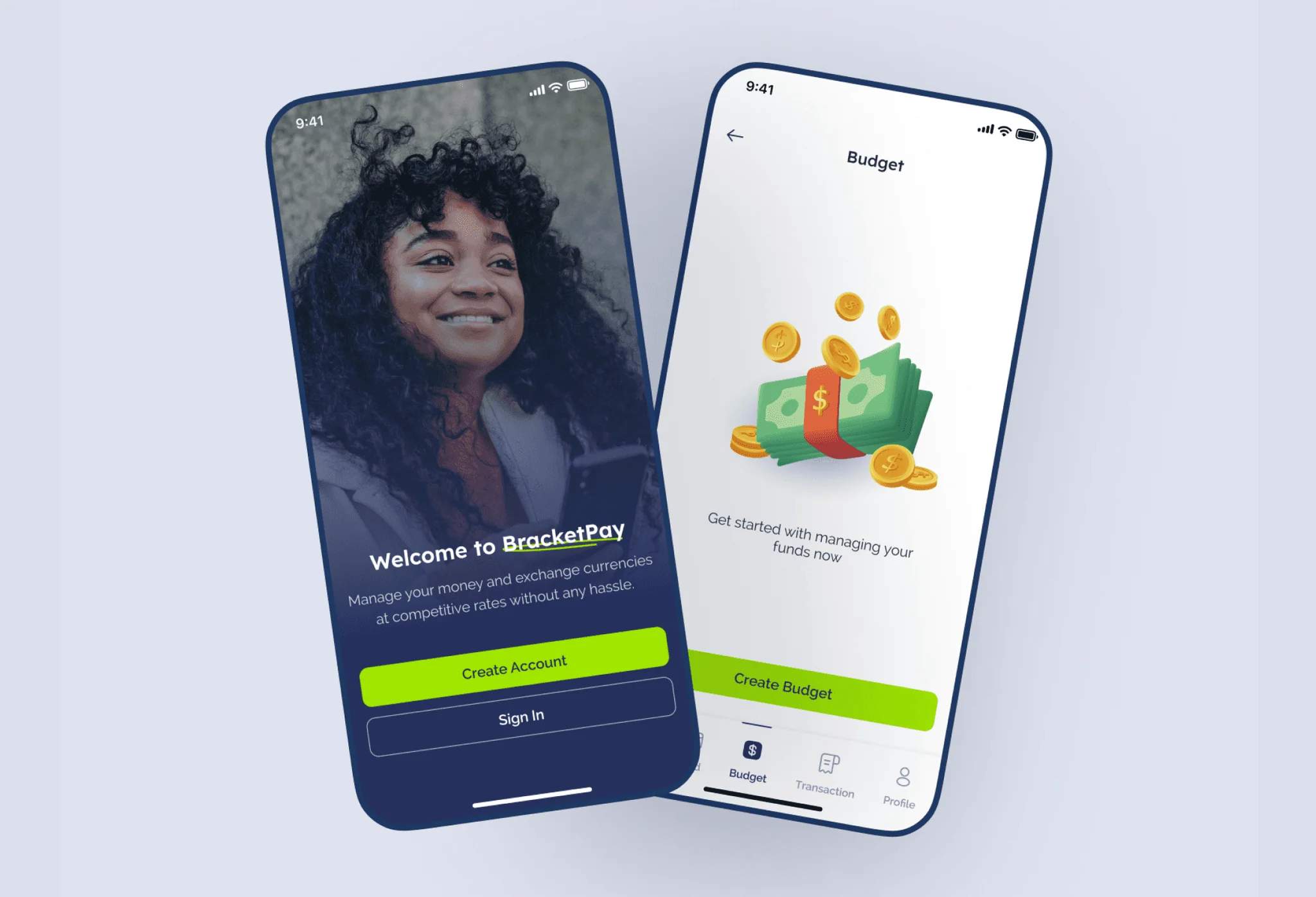
Paying for a subscription, a course or a tool priced in dollars often means finding an exchange, using a card that might be declined, then checking a bank app to see what it really cost. Budgeting happens somewhere else again.
Rates and fees are often only clear after a swap is done.
Online subscriptions and international payments can fail or come with extra charges.
People need account details they can share so others can pay them.
Budgets usually sit in a separate app or spreadsheet, away from where money is spent.
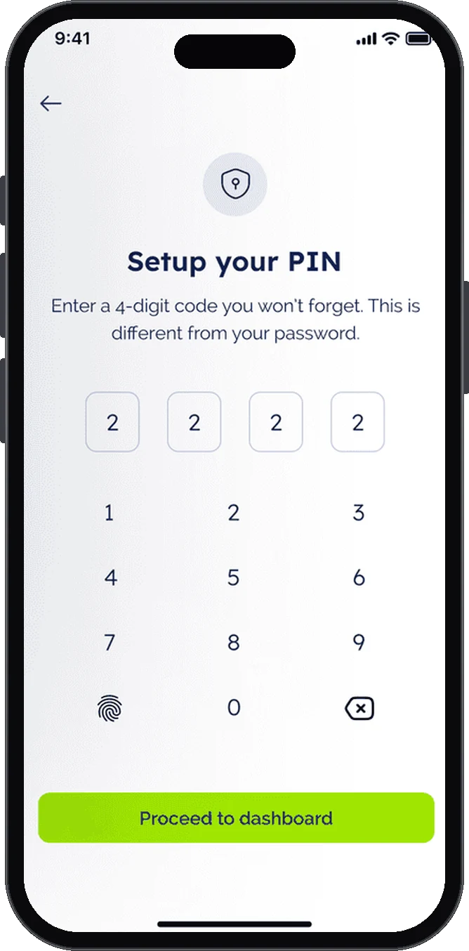
I structured onboarding around registration, identity verification and account setup. A four-digit PIN, separate from the password, keeps everyday payments quick but protected.
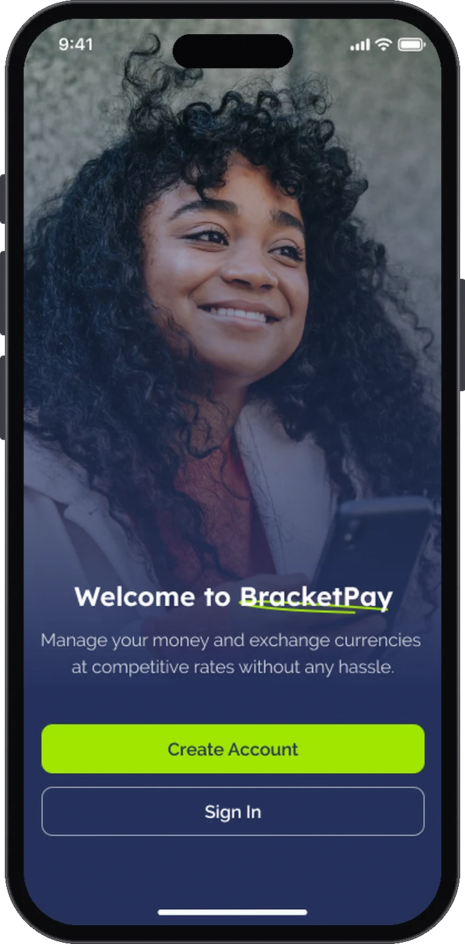
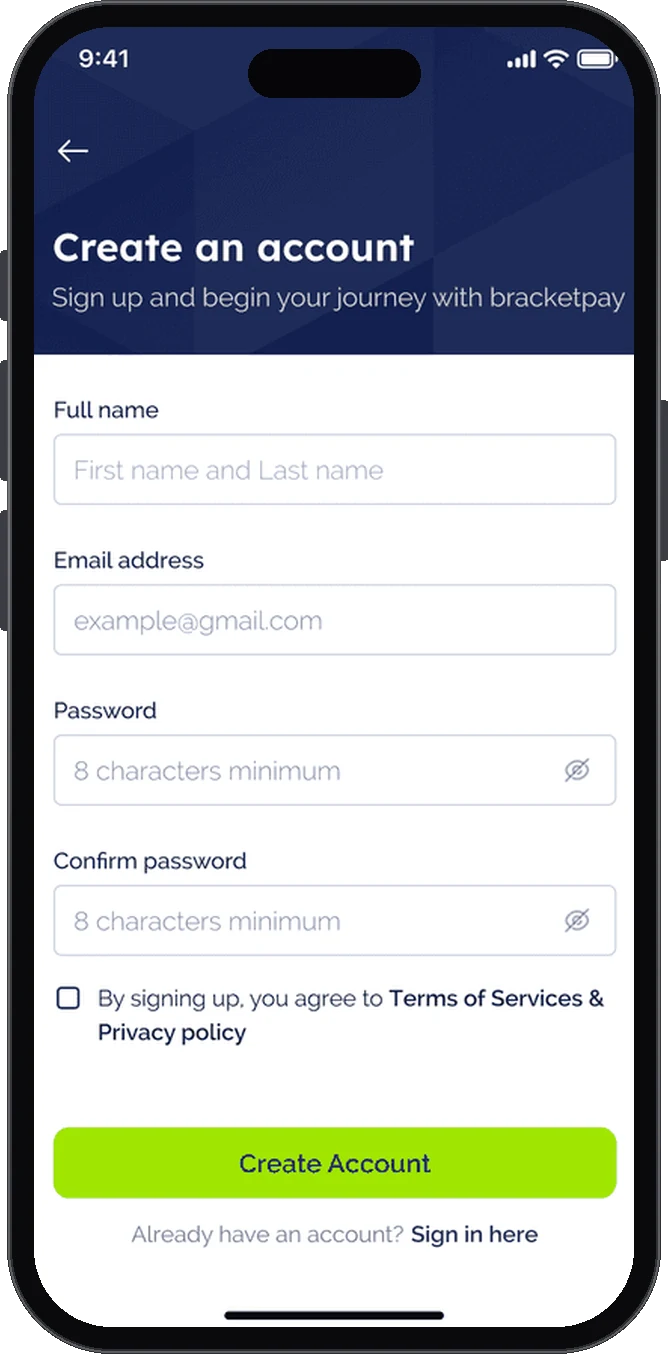
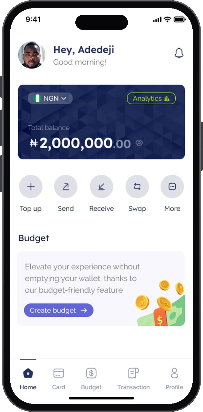
The five quick actions on the home screen lead into the app’s main flows. Each flow puts the numbers on screen before the user confirms.
The home screen shows the total balance with a currency switcher, five quick actions (Top up, Send, Receive, Swap and More), a prompt to create a budget and recent transactions.
The tab bar keeps Card, Budget and Transaction history one tap away.
The concept assumes each user would get account details through a partner bank, and that transfers into that account would top up the BracketPay wallet. No bank integration was built.
The design lets users share those details in one tap, so friends, clients or employers could pay in directly.
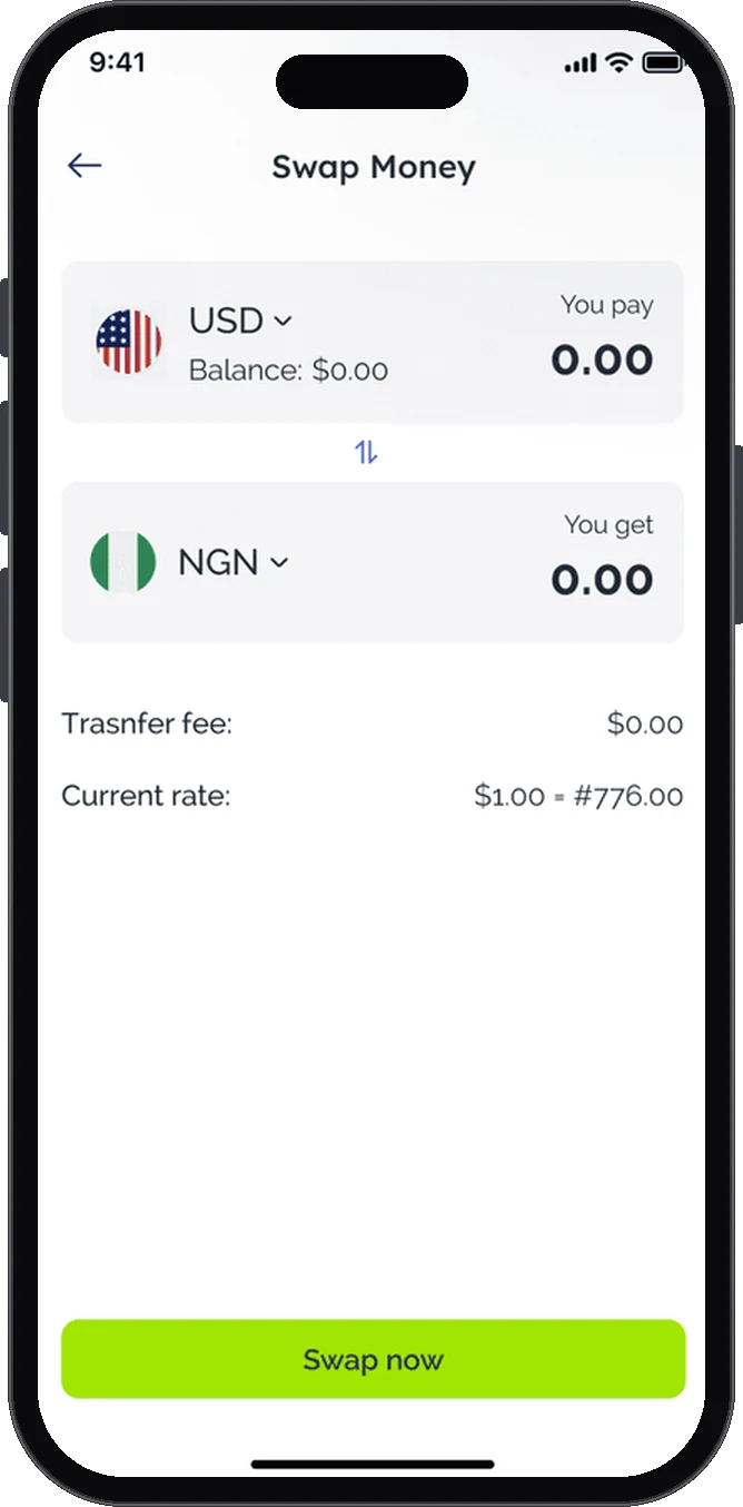
Users pick the two currencies and enter an amount. The screen shows what they pay, what they get, the fee and the current rate before they tap Swap now.
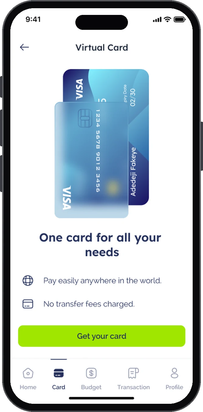
The design lets users create a virtual card for online payments around the world, aimed at subscriptions and services priced in other currencies. Low or no fees were an assumption the concept did not validate.
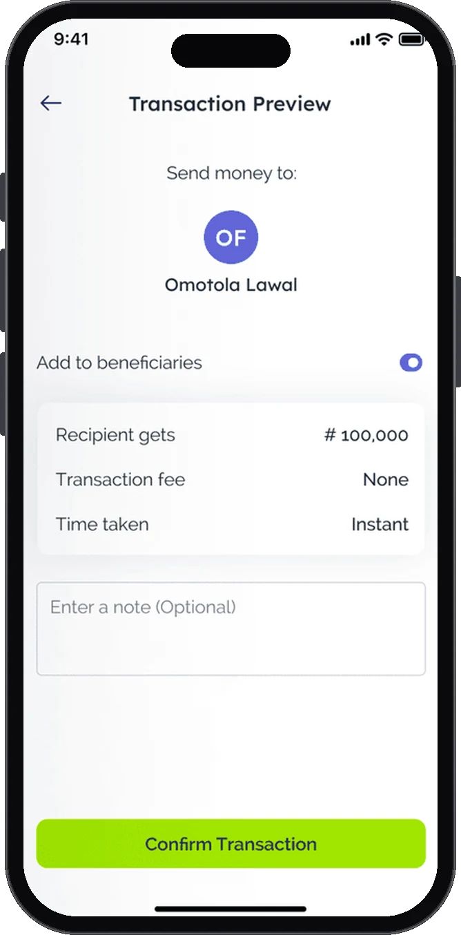
Before a transfer goes through, a preview shows who is getting the money, how much they receive, the fee and how long it takes. Users can save the person as a beneficiary and add a note.
Users only trust a fintech product when nothing about a transaction surprises them. These decisions run through every flow.
Swap and send screens show the amount received, the fee, the rate and the time it takes above the confirm button.
Set during sign-up, the PIN approves payments without asking for the full password every time.
Every primary action uses the same lime button, so the next step is always easy to spot.
Before a budget exists, the budget screen explains what budgets are for and offers one clear action: Create budget.
Lexend for headings, Raleway for body text, a deep navy for the brand, lime for primary actions and violet to mark budgeting.
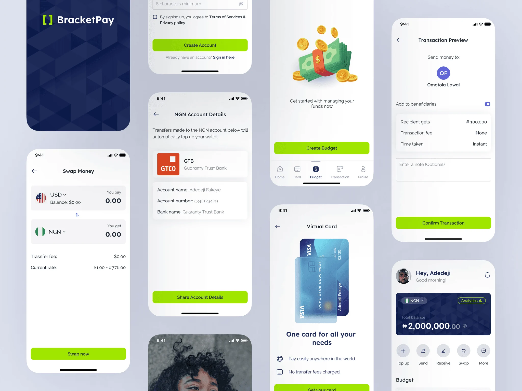
In fintech, users need to know exactly what a transaction will do before they confirm it. Putting the rate, fee and recipient on screen first shaped most of the app.
Run usability sessions on swapping and sending to check that people understand the rate and fee before they confirm.
Let users keep USD or GBP balances next to naira, using the currency switcher already on the home screen.
Show recurring card payments in one place, so people can see and cancel subscriptions paid with the virtual card.