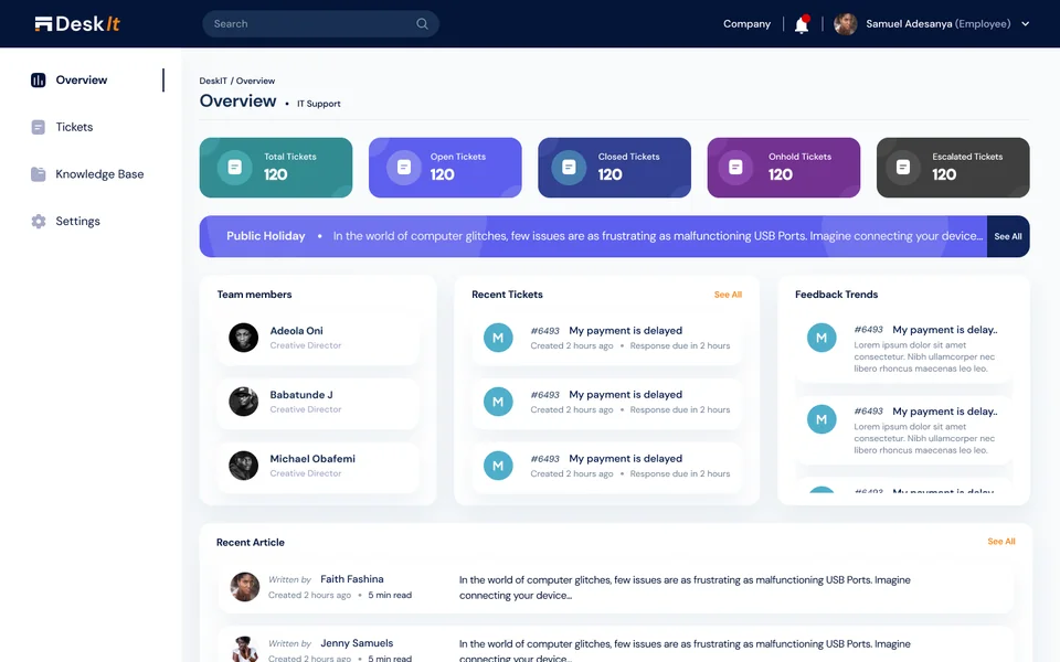
Web & QR ordering
Menu access and ordering where supported.
Case Study 01 · Restaurant commerce & operations
A multi-tenant platform that helps restaurant brands manage identity, menus, orders, branches, teams, payments and communication, while connecting waiter and kitchen workflows across instant and pre-order service models.
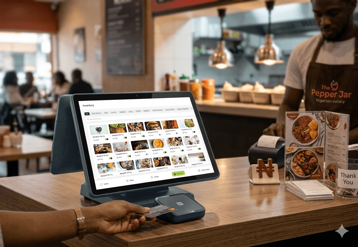
Support different restaurant service models while keeping orders, preparation and branch oversight connected.
As the sole Product Designer, I designed the admin, waiter and kitchen experiences across web, tablet and mobile.
Keep order states consistent across roles while adapting actions to instant and pre-order service.
Designs completed and handed off to engineering. Five moderated usability sessions led to changes in menu creation, sales-item scanning and branch reporting.
The goal was not to digitize an order form. It was to create a flexible SaaS product that restaurants could adapt to their own business.
Restaurant orders do not move through one interface. A waiter may create an order, a kitchen team prepares it, another staff member completes the handover, and a manager needs visibility afterward.
An update made by one role must be understood by everyone affected by it. The product therefore shares orders, status language, payments and notifications while giving each role a focused interface.
Menu access and ordering where supported.
Progress and ready numbers for restaurants that use a customer-facing screen.
Every role and screen sees the same live order, from the moment it is placed until it is served.
Role-specific tablet and mobile views for service, preparation and handoff. The tablet interface also runs on in-store terminals.
Menus, branches, teams, finance, brand, settings and oversight.
I began with stakeholder meetings, then interviewed restaurant owners and waiters to understand current workflows, recurring pain points, branch differences and service realities.
I reviewed Chowdeck, Glovo, The Place, Mega Chicken, Uber Eats, DineSurf and Kappture, then developed journeys, sketches and wireframes through recurring stakeholder reviews.
Mapped service journeys across instant and pre-order restaurants, dine-in and pickup.
Primary perspectives: restaurant owner, customer, waiter and kitchen staff.
Direct, indirect and reference products reviewed.
Moderated usability-testing sessions completed.

Core priority: Understand what is happening across branches without being physically present at each location.
Branch-level performance, staff visibility, configurable menus, clear financial records and control over the restaurant’s identity.
Aggregate information hides branch differences, while rigid tools do not reflect how each location actually operates.
Core priority: Find the right item quickly and know exactly what happens after an order is sent.
Fast item selection, clear table and customer context, visible order progress, reliable payments and direct kitchen handoffs.
Dense sales interfaces, slow item scanning and unclear preparation states create delays when service is busy.
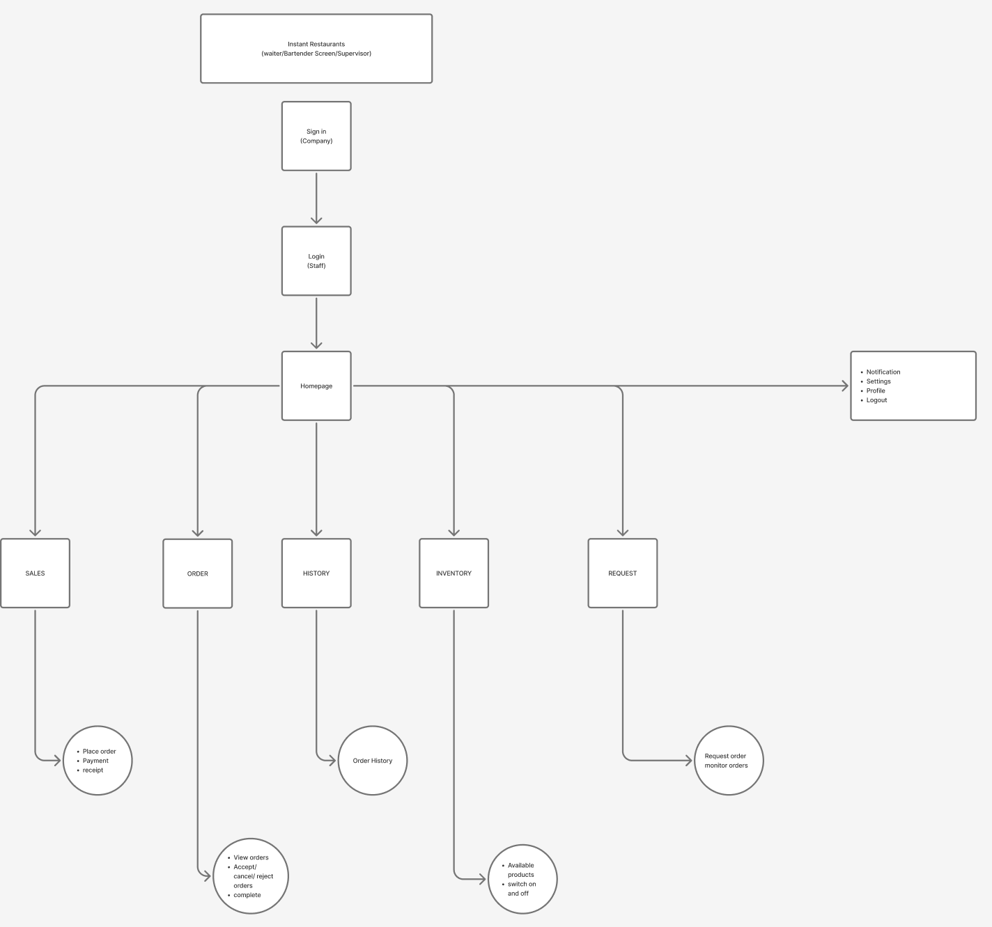
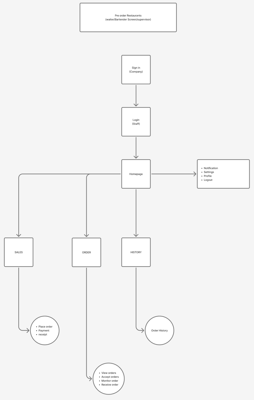
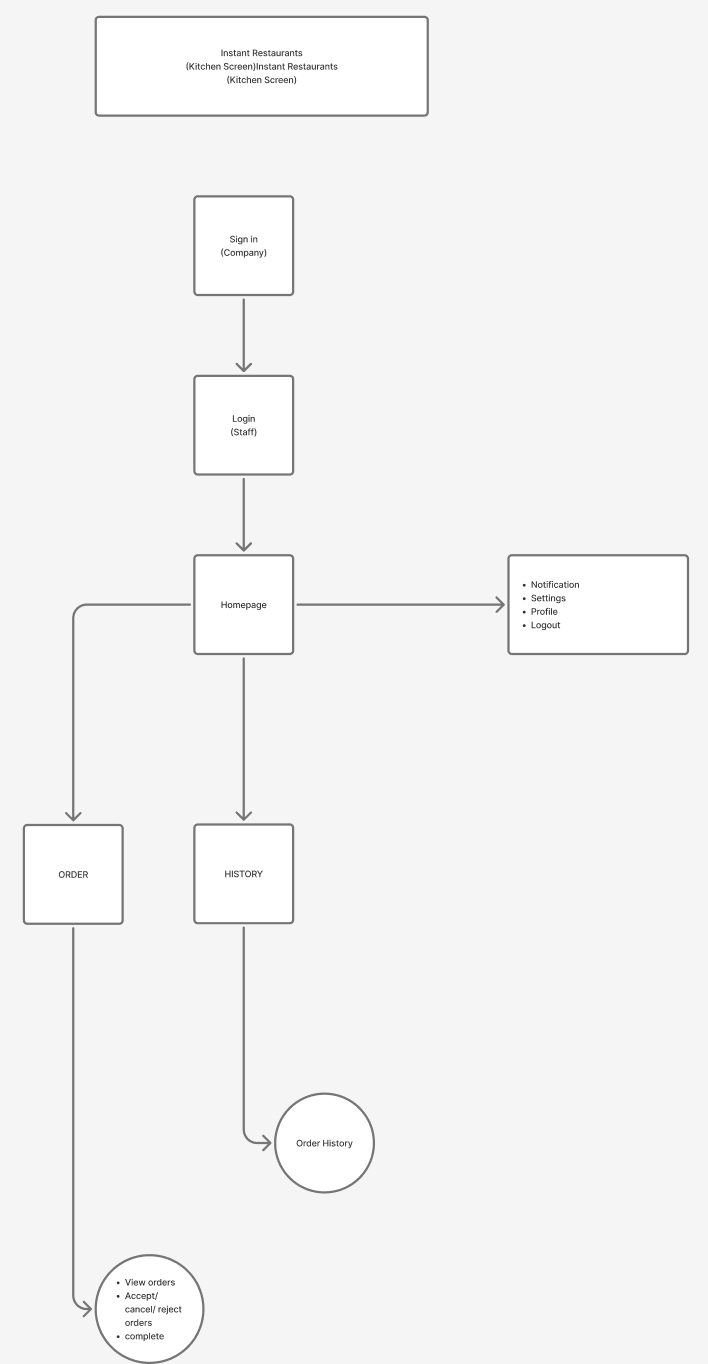
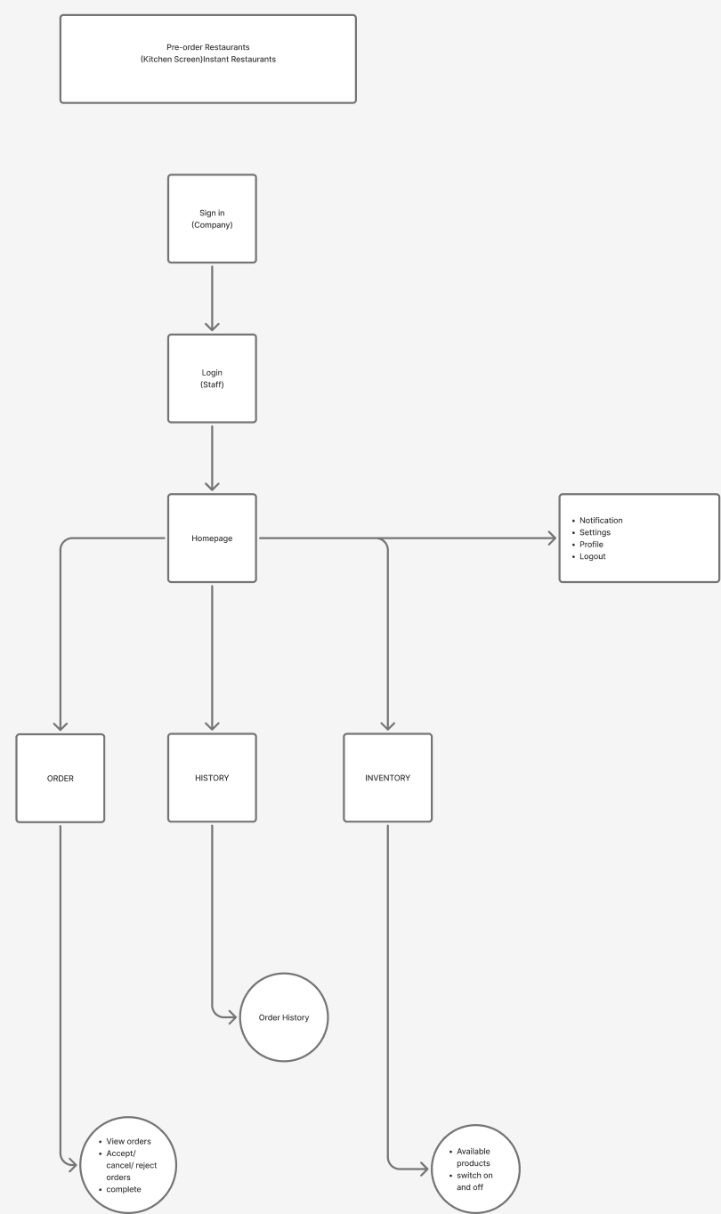
After the interviews, I mapped the waiter and kitchen apps for both service models in FigJam. Every app shares the same entry and account pages. What changes is the work each screen has to support.
Shared by every appCompany sign-in → Staff login → HomeNotifications · Settings · Profile · Logout
What the map revealedWho controls item availability depends on the service model. In instant restaurants the waiter switches items on and off, because the food is already made. In pre-order restaurants the kitchen does, because it cooks to order.
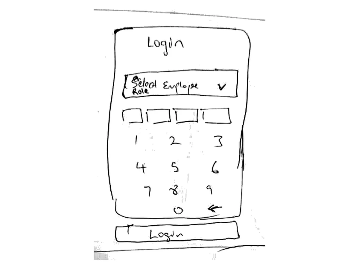
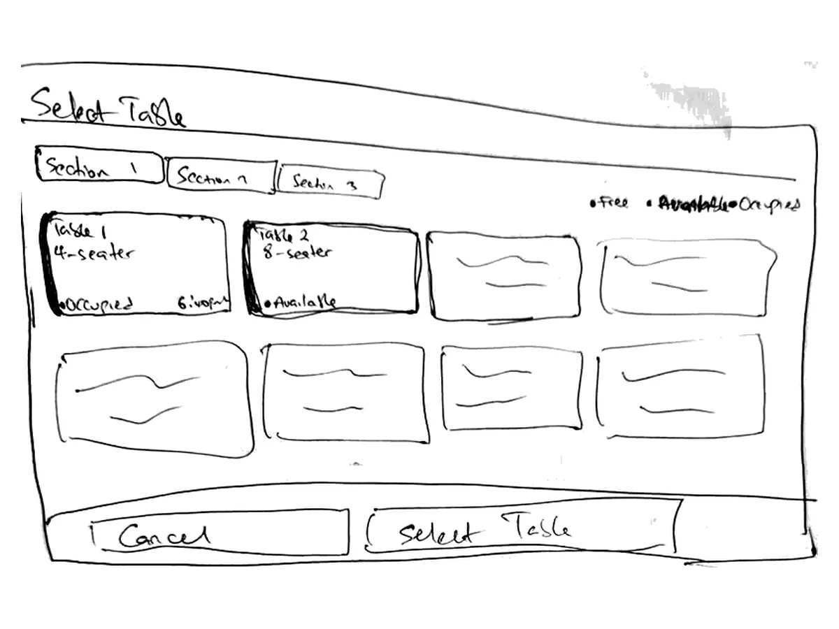
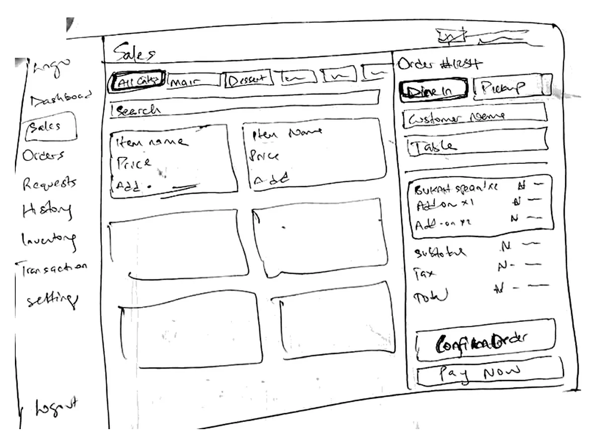
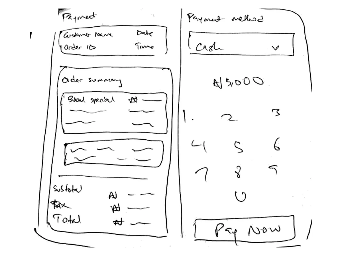
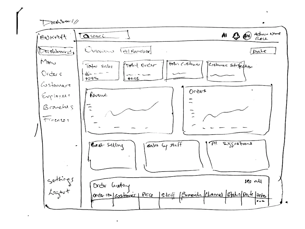
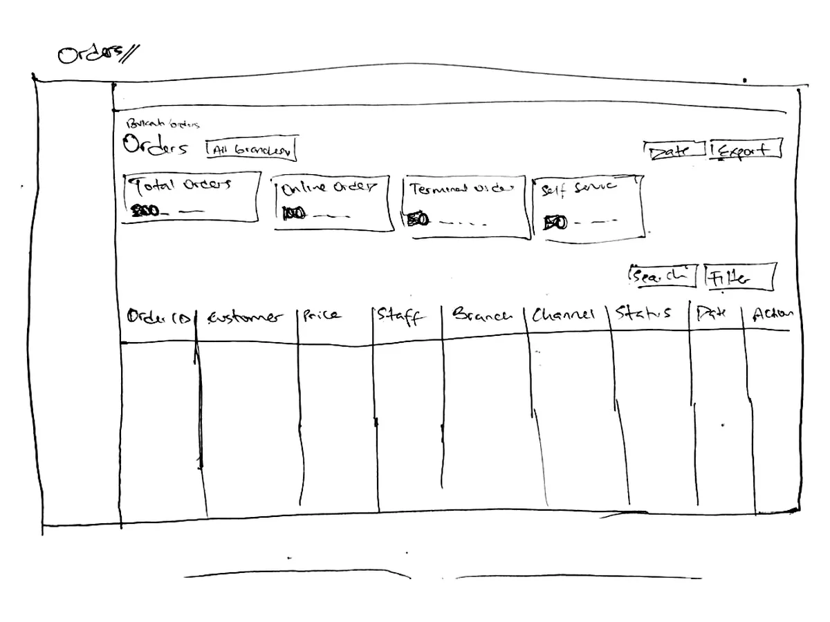
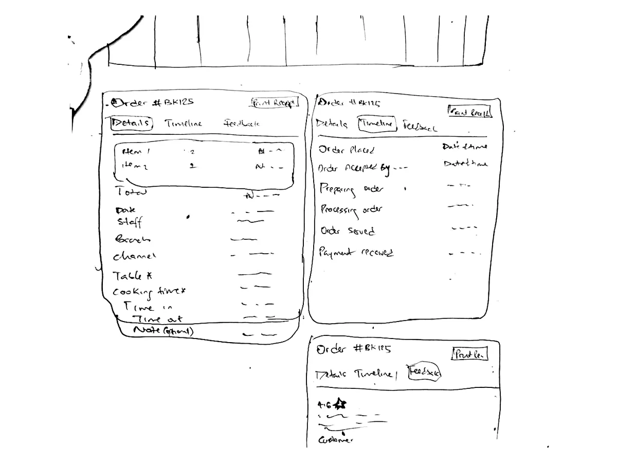
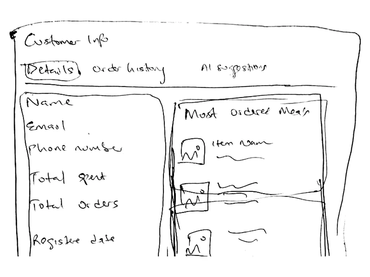
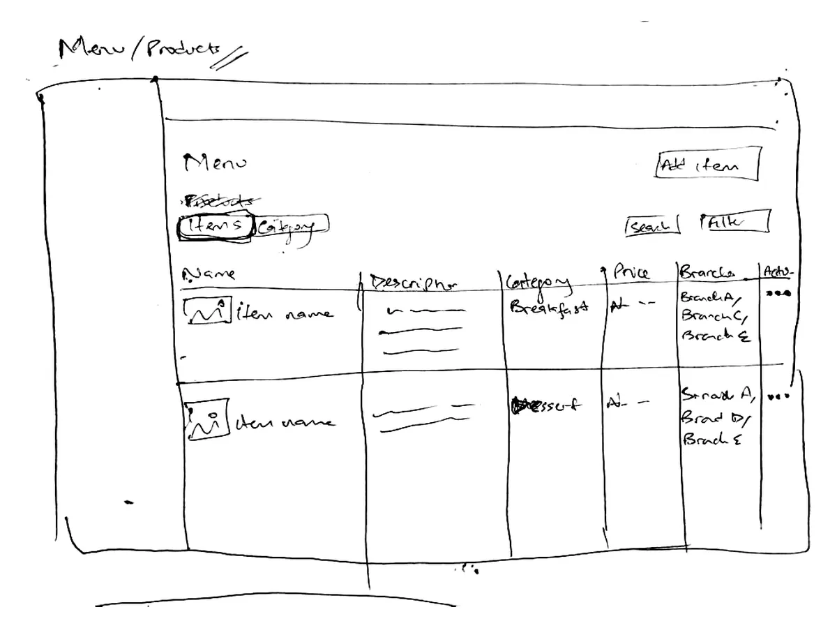
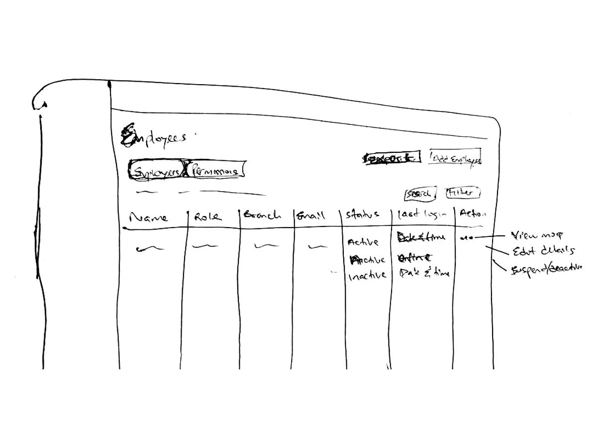
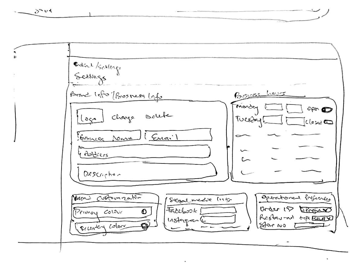
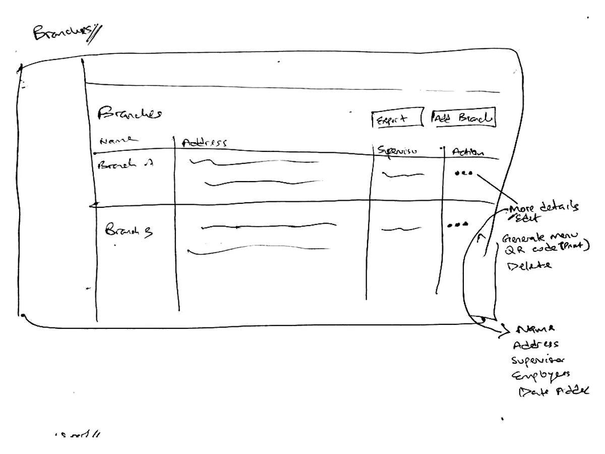
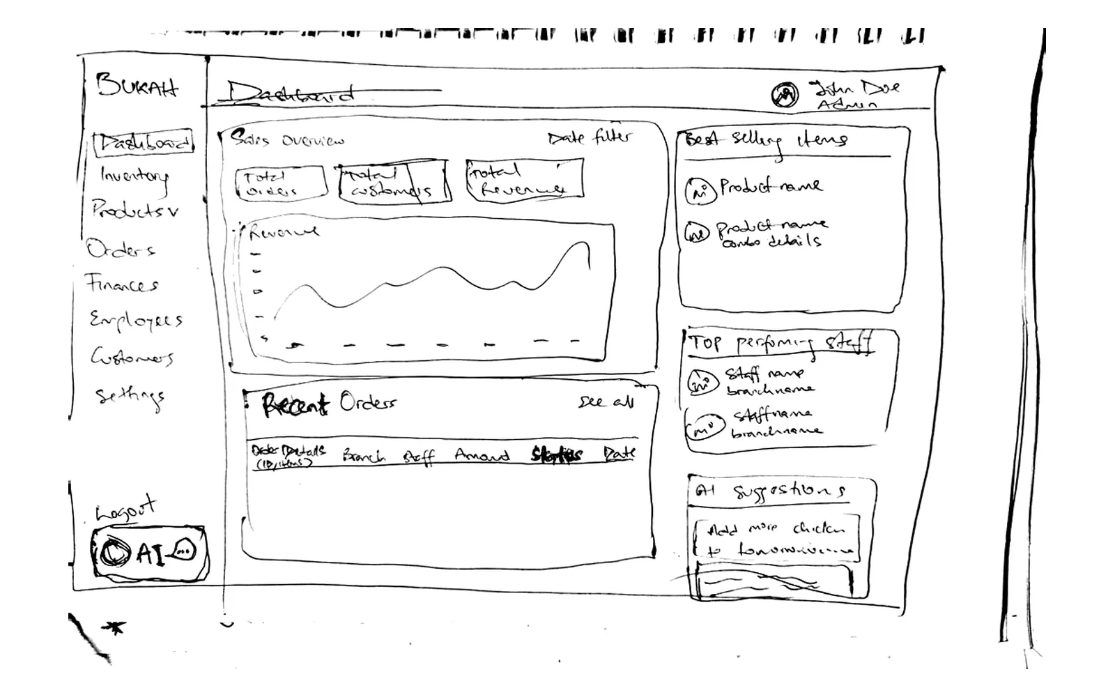
Before moving to Figma, I sketched the waiter app and every admin page by hand. Paper made it quick to try layouts, walk the stakeholder through them and redraw.
Waiter app
Admin dashboard
BUKAH subscription plans, billing and shared product rules.
Operating mode, identity, hours, tax, payments, policies and communications.
Locations, tables, supervisors, staff permissions, terminals and daily views.
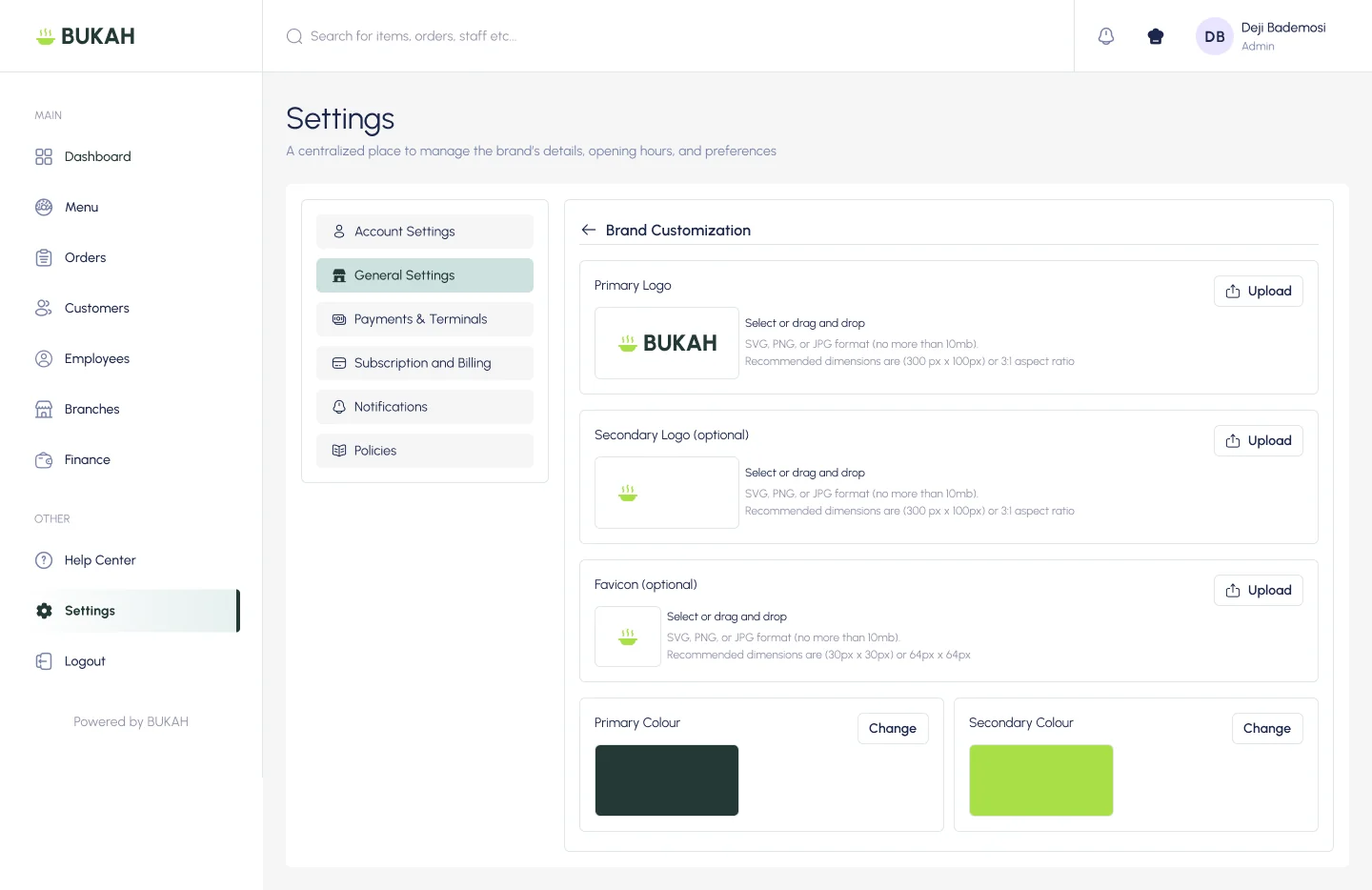
Each restaurant uploads its logos and sets its own primary and secondary colours, so the product carries its brand.
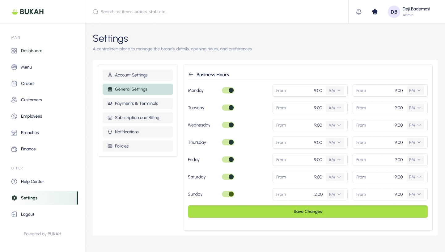
Opening and closing times for each day, with a switch for the days a restaurant is closed.
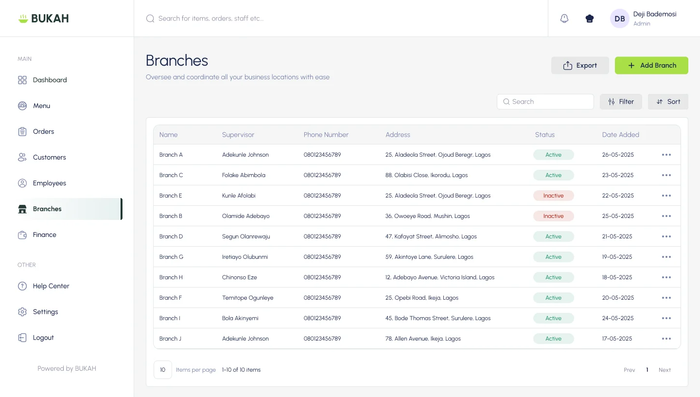
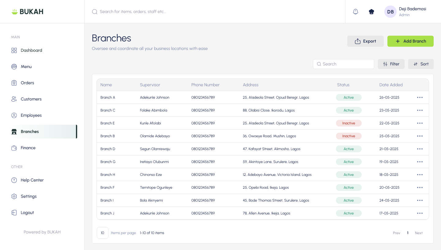
Add locations, assign a supervisor and mark each branch active or inactive.
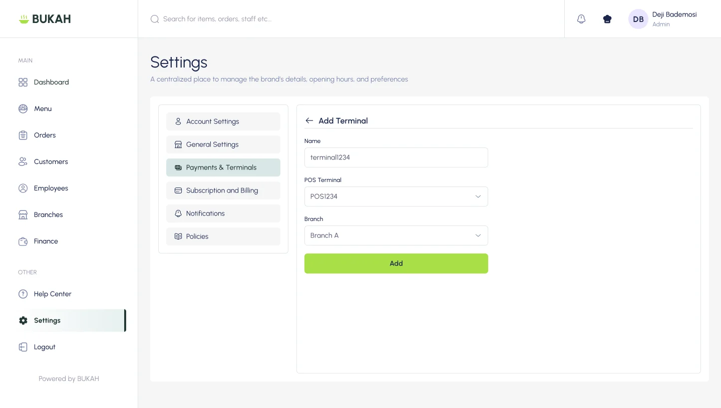
Register terminals and link each one to a POS device and the branch it belongs to.
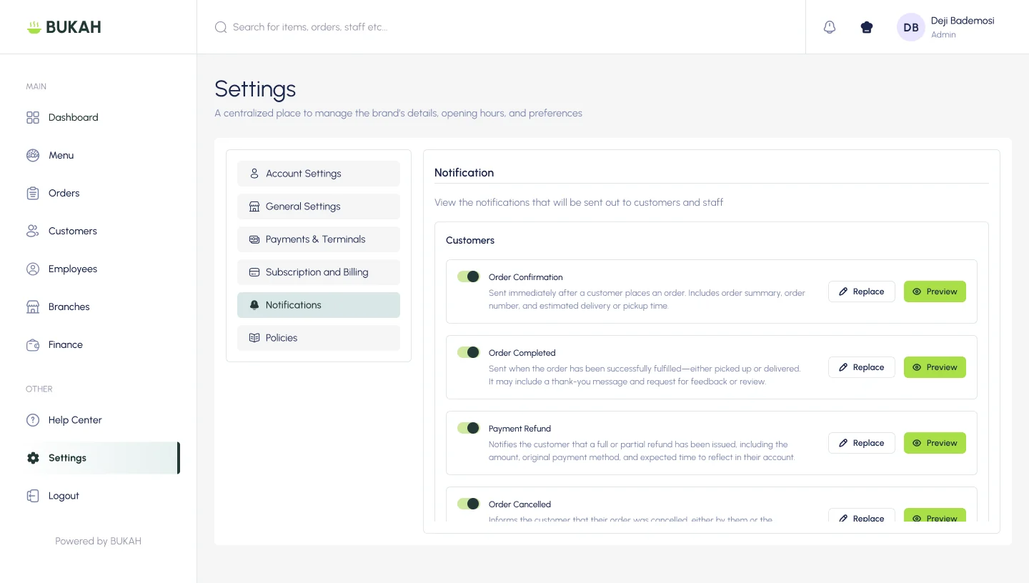
Choose which emails customers receive, then preview or replace each template.
I formalized recurring interface patterns into foundations and reusable components so the product could stay consistent as roles, branches and workflows expanded.
The two brand colours were specified in the product brief. Supporting neutrals, state colours, spacing and component rules were standardised from recurring interface patterns and accessibility needs.
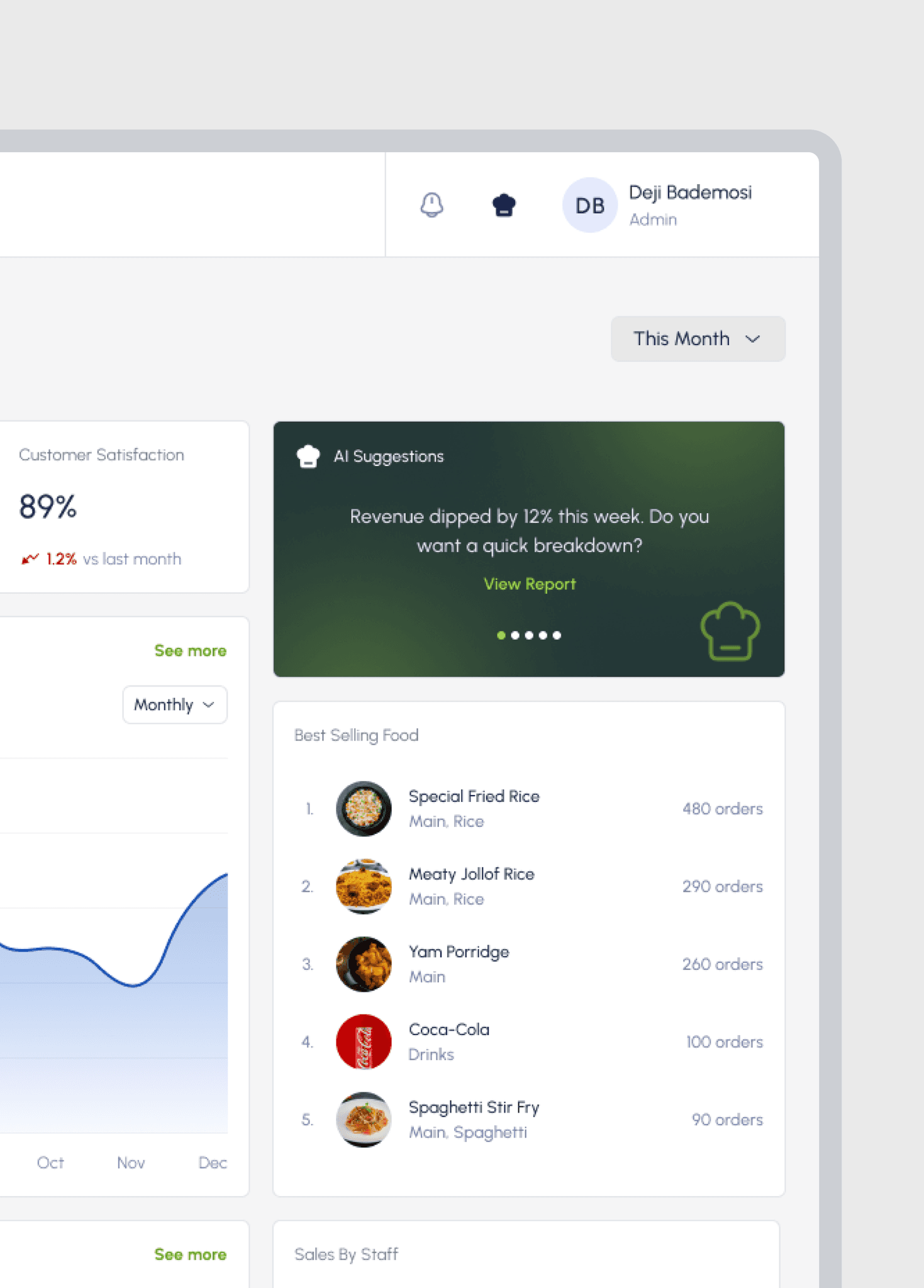
Revenue dipped by 12% this week. Do you want a quick breakdown?
View ReportComponents adapt in density and priority without changing their underlying meaning.
Order and payment states retain the same language and colour meaning across surfaces.
Layouts reduce and reflow for tablet and mobile rather than simply shrinking desktop screens.
Colour is supported by labels, icons and contrast so meaning never depends on hue alone.
Both restaurant models use orders, customers, payments and staff, but preparation and handover work differently. The interfaces share patterns while changing the actions that matter.
Acceptance, preparation time, progress and coordinated handover are explicit.
Speed, availability, payment and packing or serving take priority.
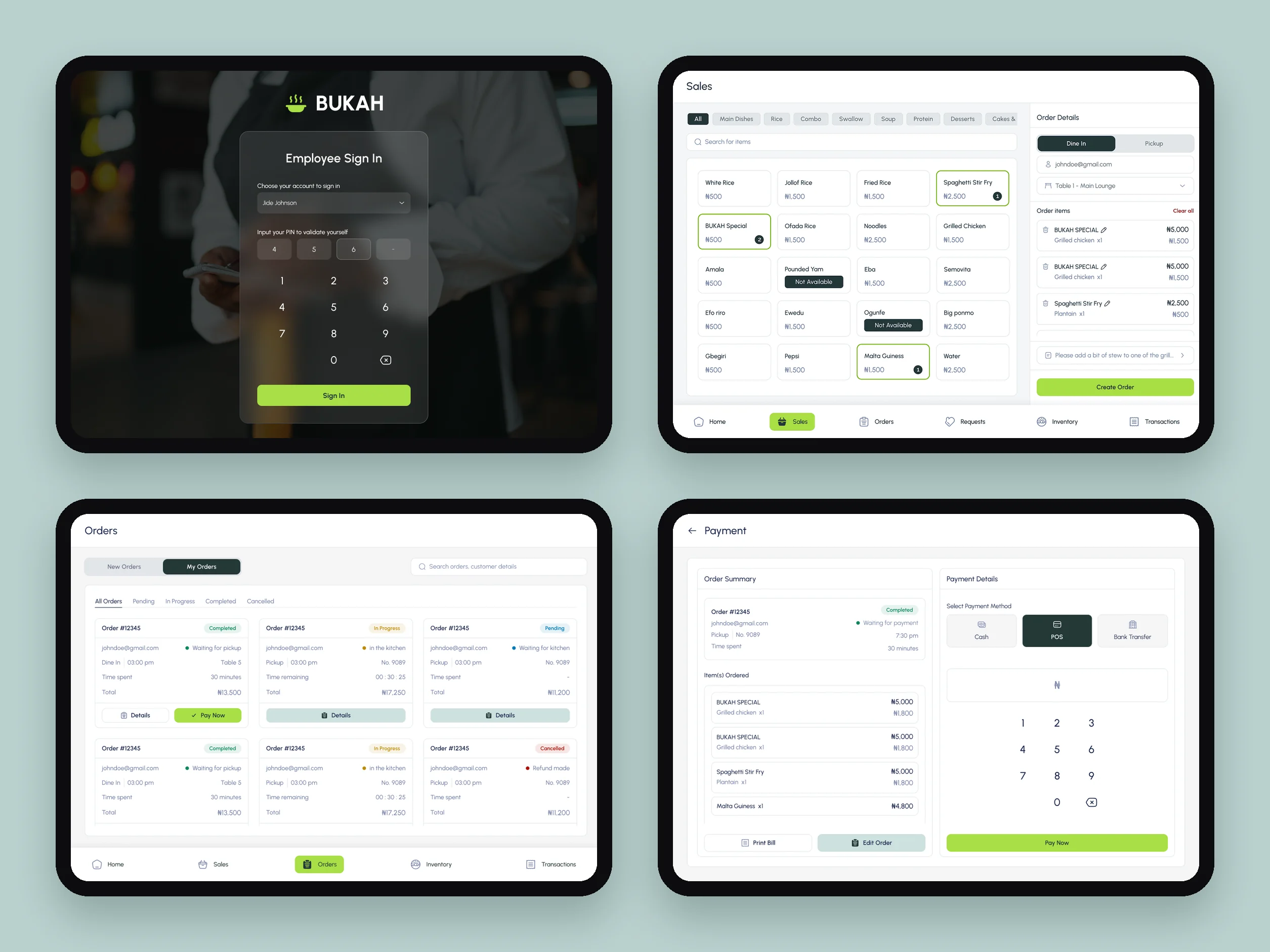
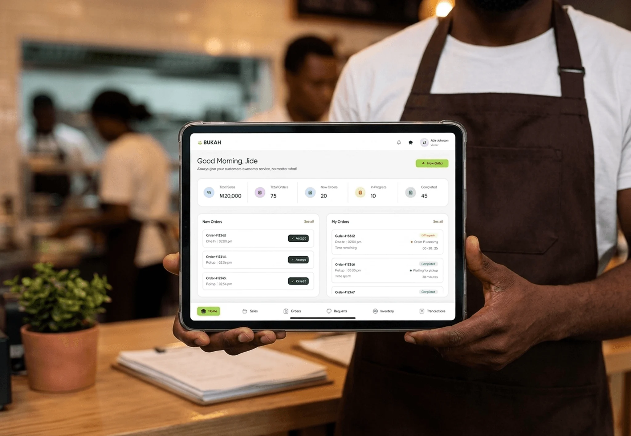
Instead of exposing the entire product to every employee, navigation and information density reflect responsibility. Shared status patterns preserve continuity between roles.
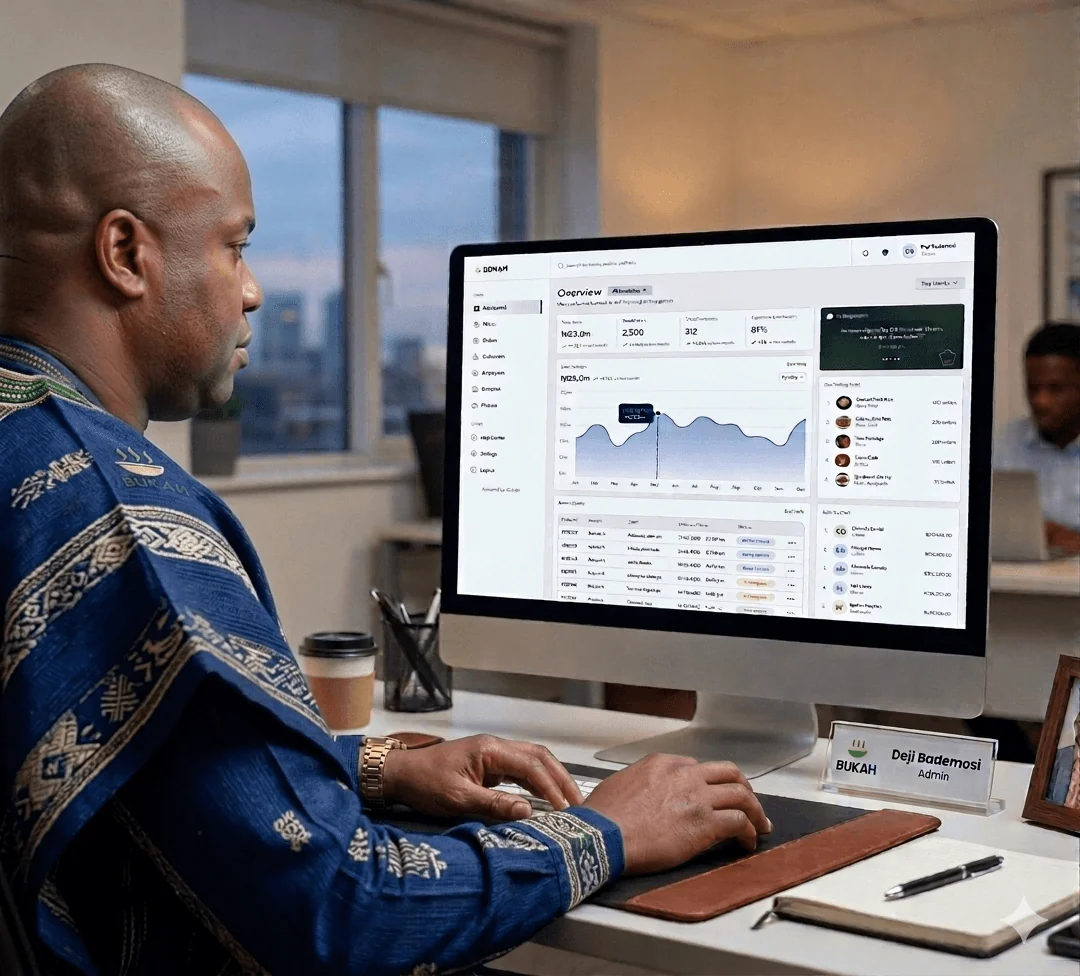
Oversight across menus, orders, branches, staff, finance, settings and restaurant performance.
Fast sales, table context, order progress, payments, receipts, refunds and kitchen requests.
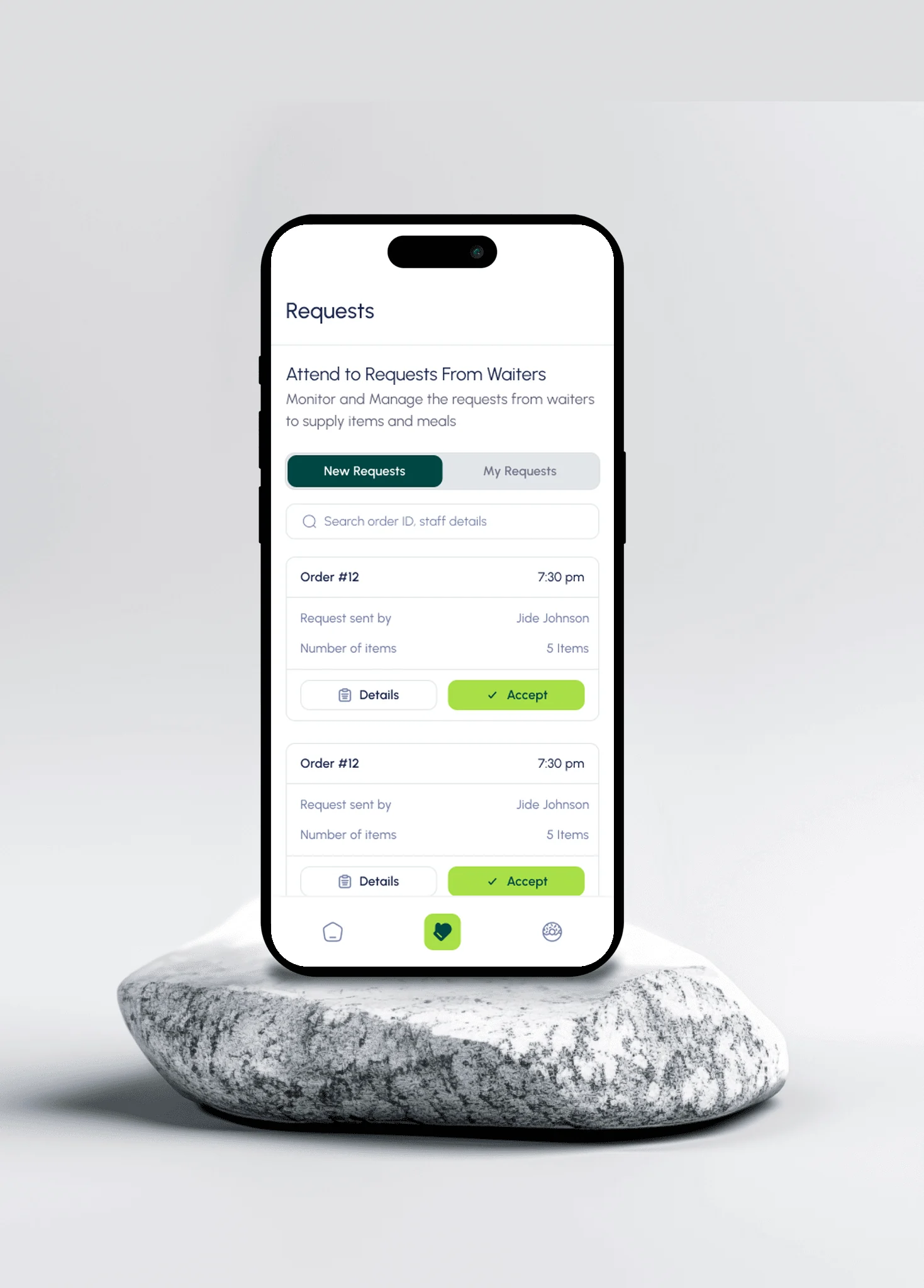
Focused incoming work, acceptance, preparation timing, completion and waiter notification.
Task-based evaluation with the stakeholder and representative users across menu creation, service speed and branch oversight.
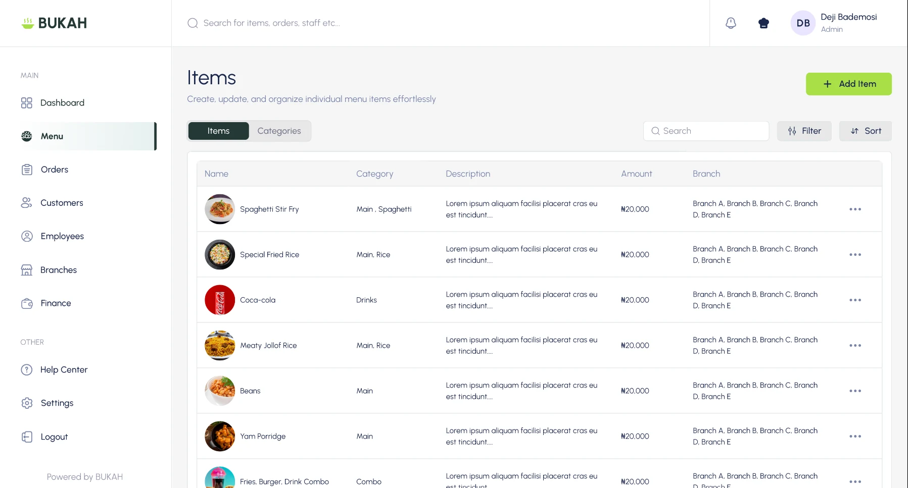
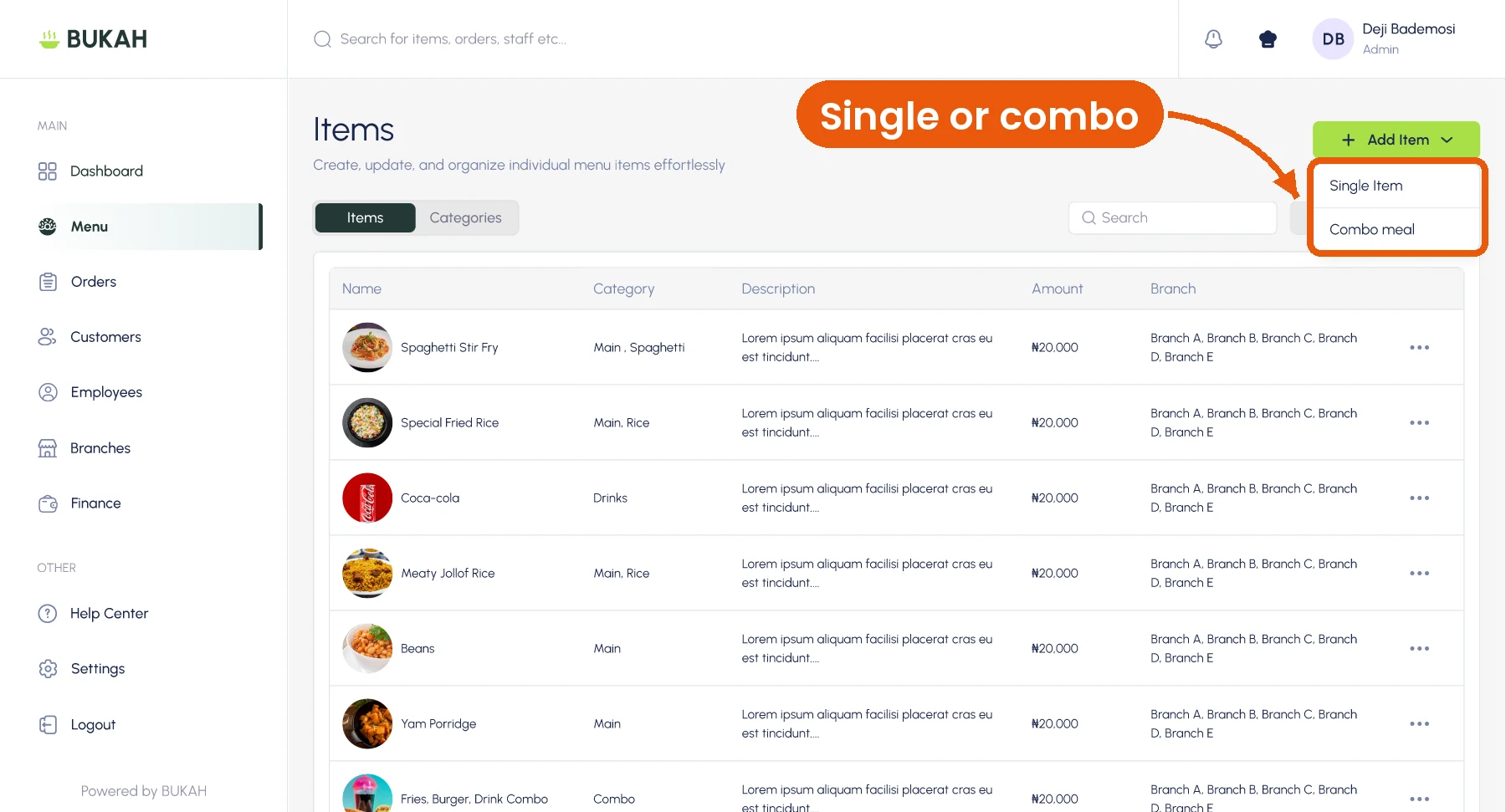
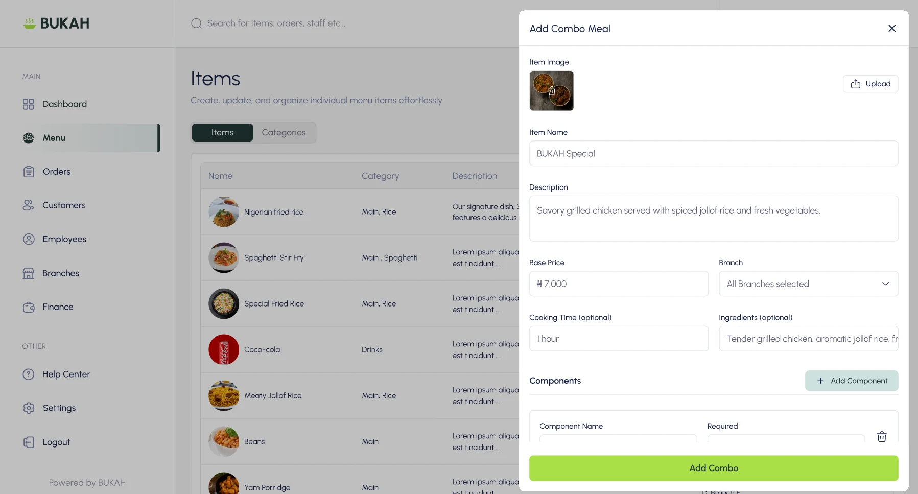
FindingSingle items and combo meals used the same setup, while owners needed different menus by branch.
ChangeI separated item types, added branch assignment, and introduced required or optional combo components with minimum and maximum selections.
FindingLarge image-led cards reduced the number of items visible at once, and alphabetical ordering slowed frequent selections.
ChangeI removed nonessential imagery, compacted the cards and prioritised commonly sold items.
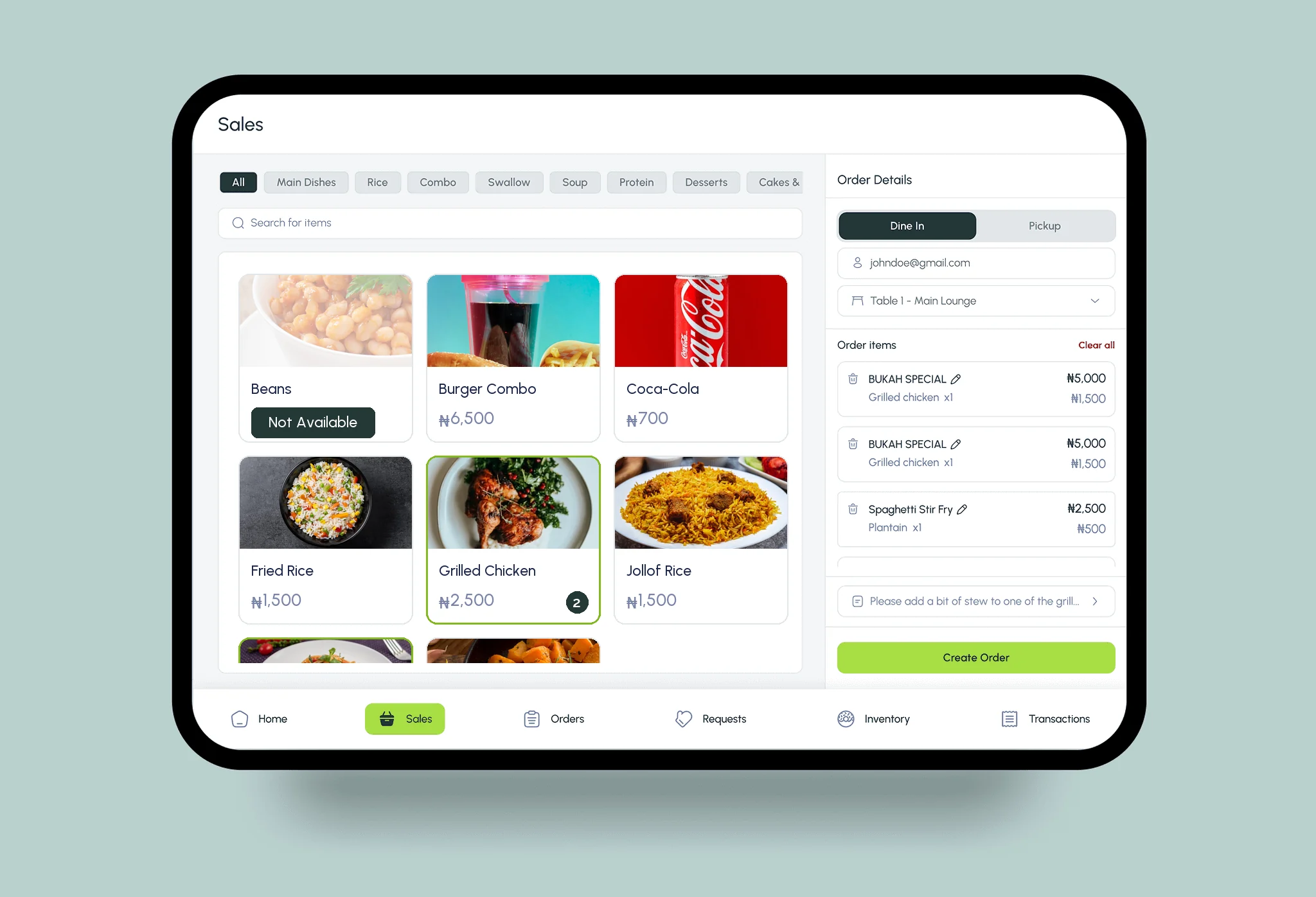
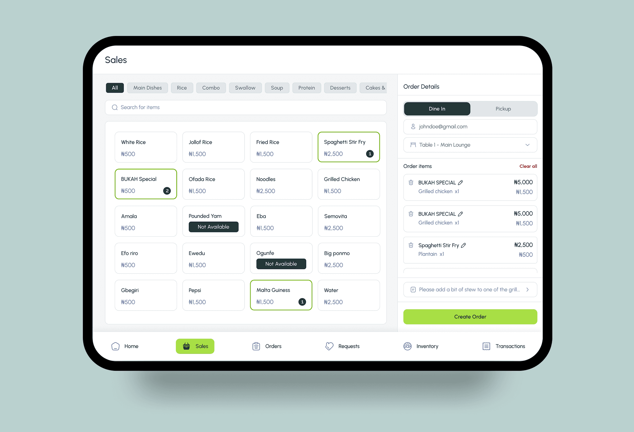
FindingAggregated reporting hid which locations and staff were performing well or poorly.
ChangeI added a Branches module and branch filters across Dashboard, Orders and Finance.
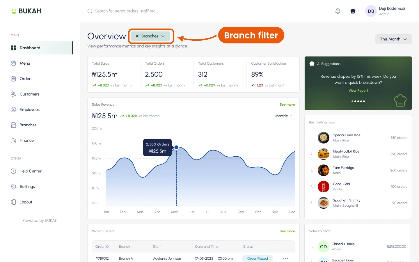
The assistant summarises reports, suggests next steps and flags what needs attention. Every task can still be done with the normal controls, so no one has to rely on AI to get work done.