Redesign the company website so it reflects the quality of PDL’s work and helps the business win clients, partners and new hires.
Case study · Corporate website redesign
Polaris
A website that lets a geospatial company’s work speak for itself.
Polaris Digitech (PDL) is a geospatial technology company. I redesigned its website so visitors can quickly see what PDL does, see proof of it, and get in touch.
The challenge
Replace a corporate website that made the company’s services, products and project experience difficult to assess.
My contribution
I audited the existing website, reorganised its content and navigation, and designed the desktop and mobile pages.
Key decision
Bring project evidence forward and give visitors clear paths to relevant products, services and enquiries.
Outcome
Launched at polarisdigitech.net with restructured navigation, project pages and dedicated mobile layouts. Post-launch results are not yet available.
(01)Overview
A strong company with a website that undersold it.
PDL has 22+ years of experience and 40+ corporate clients, but the old website didn’t properly show its products, services or client projects.
(02)Audit
What the old site was getting wrong.
I went through the old site page by page and marked every place where it made visitors work harder than they should. The numbers on the homepage below match the findings.
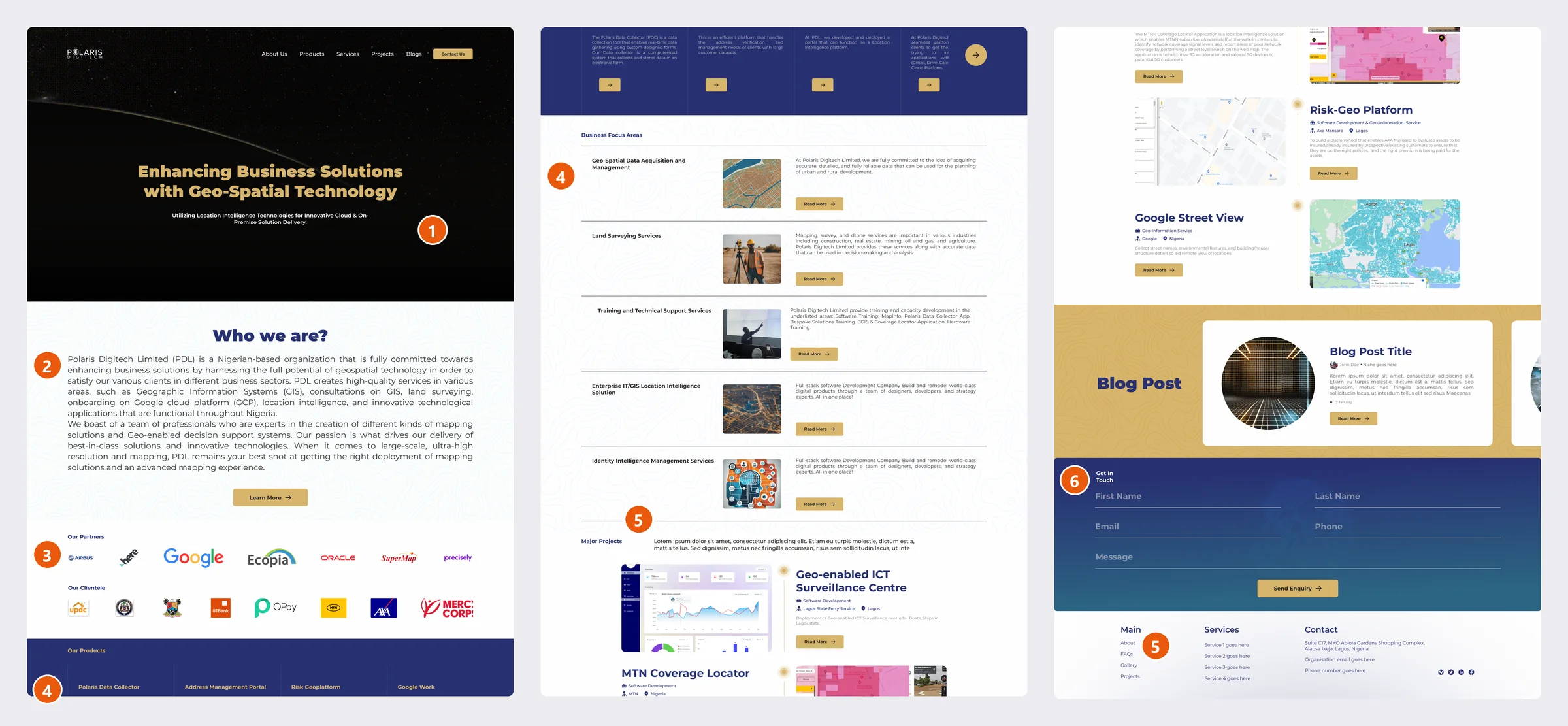
No next step on the first screen
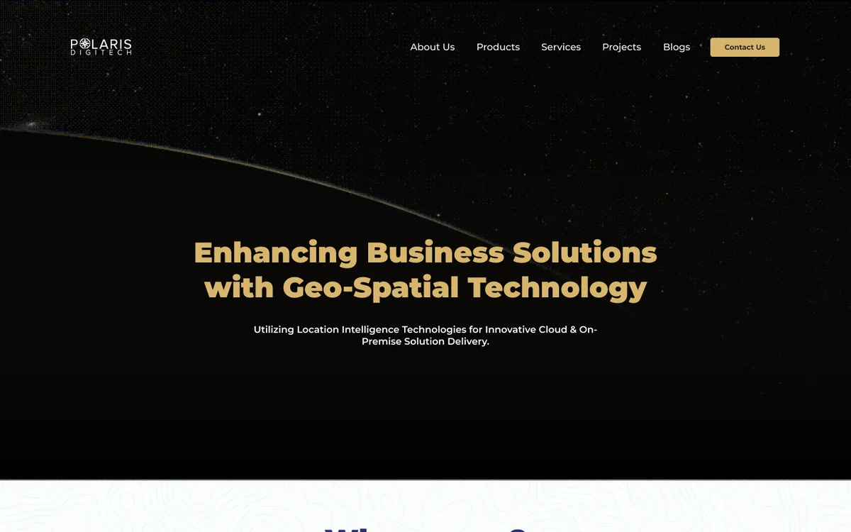
The hero had a headline and a dark background but no button. The only way forward was a small Contact Us link in the corner.
A wall of justified text
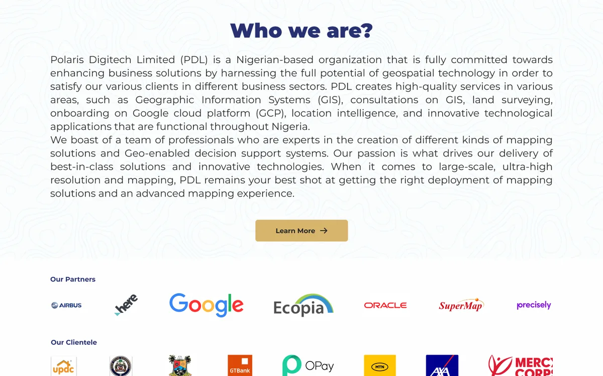
“Who we are?” explained the company in two dense, justified paragraphs that most visitors would skip.
Proof squeezed into thin strips
Partners such as Google and Airbus and clients such as MTN and AXA appeared as two rows of small logos with no context.
Offers hidden in small print
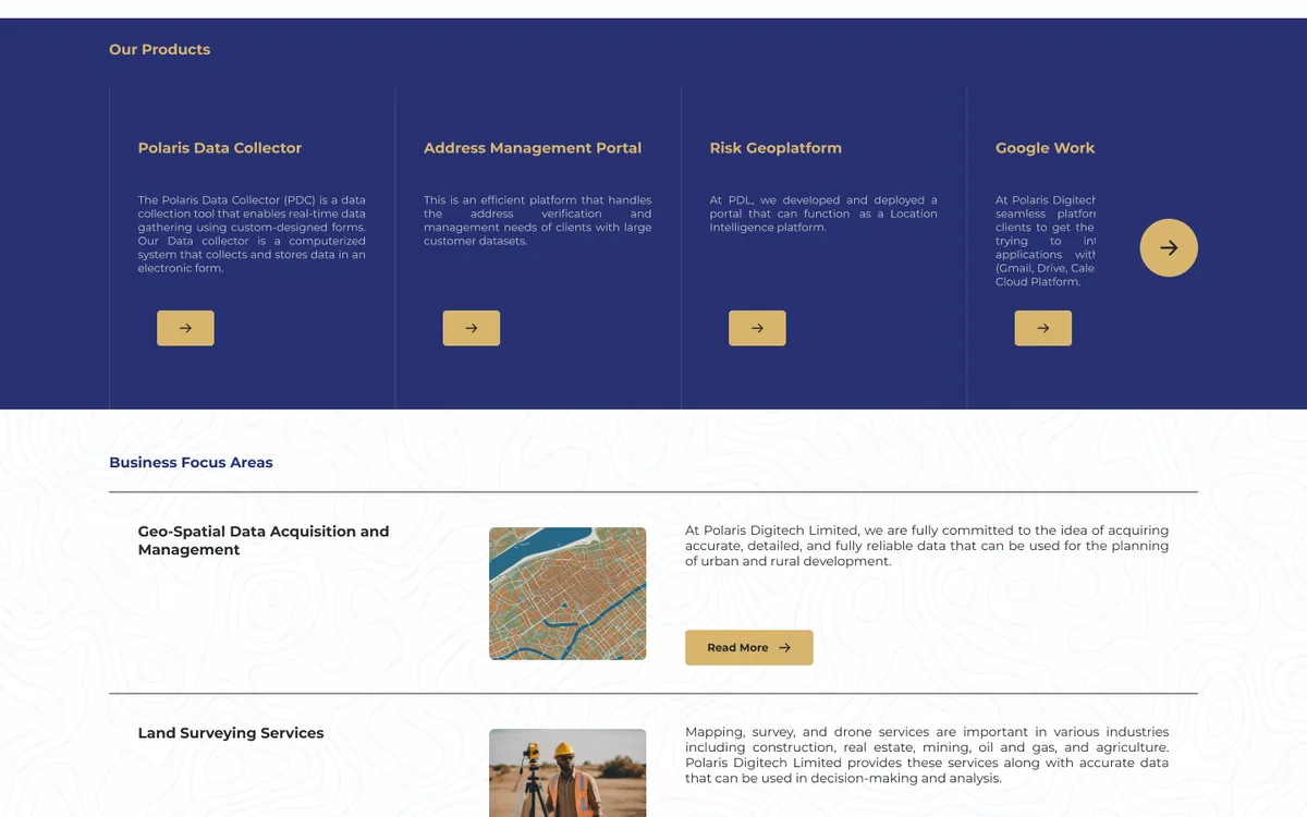
Products sat in narrow navy cards with tiny text, and every service used the same row of image, paragraph and Read More.
Placeholder copy on live pages
Lorem ipsum introduced the projects on the homepage and the Projects and Services pages. The footer still said “Service 1 goes here”.
One generic form for everyone
Every page ended with the same enquiry form, whether the visitor wanted a demo, a partnership or a job.
(03)Goals
Four goals for the redesign.
The audit pointed to one problem: the site described PDL instead of showing it. Each goal answers part of that.
Show proof early
Put numbers, clients and real project screens near the top of each page, before any long explanation.
Make every offer easy to find
Any product, service or project should be two clicks away from any page.
Write less, say more
Replace placeholder and dense copy with short, specific sentences.
Give every visitor a next step
Use clear actions like Schedule a meeting and View all projects instead of one generic form.
(04)Navigation
A menu that shows what PDL actually offers.
The old menu had five links, each leading to a long listing page. I grouped everything under Products, Services and Projects, opened each one into a menu that lists every item with a short description, and added Careers so PDL could hire through the site.
Before
About UsProductsServicesProjectsBlogsContact Us
After
Products
- Polaris Data Collector
- Risk Geo-Platform
- Address Management Portal
- Partners’ products: Google Workspace, Google Cloud, Google Maps, MapInfo, satellite imagery
Services
- Software Development
- Land Surveying
- Customer Address Verification
- Geospatial Data Acquisition Management
- Training & Technical Support
Projects
- MTN Coverage Locator
- Geo-enabled ICT Surveillance Centre
- Risk Geo-Platform
- OLIS – Osun Land Information System
- Google Street View
- + 3 more
Company
- About Us
- Careers New
- Blog
- Contact Us
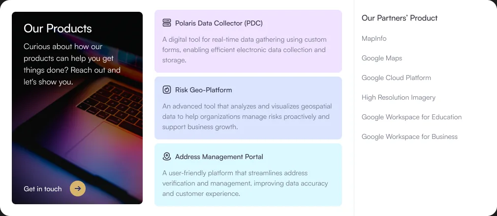
Products
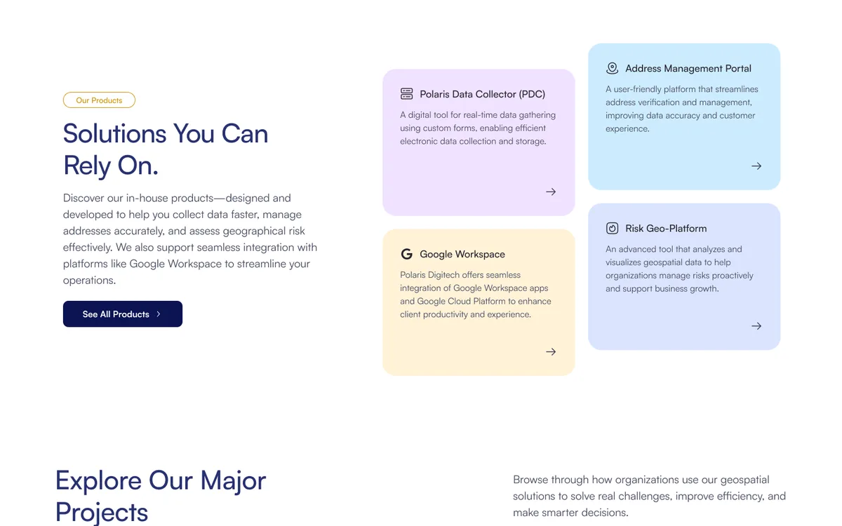
In-house products with their own tint, partner products listed beside them.
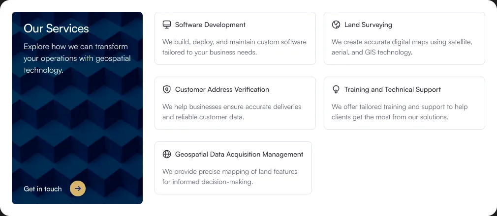
Services
Every service with an icon and one line on what PDL does.
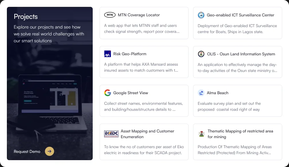
Projects
Client logos first, so visitors recognise the work before reading.
(05)Homepage
Rebuilding the homepage around proof.
The homepage had the most to fix. I kept the content PDL already had (the message, services, products, projects and clients) and changed the order and form, so each section answers the next question a visitor has.
The first screen
BeforeA gold headline on a black background, with no button and nothing about who PDL works with.
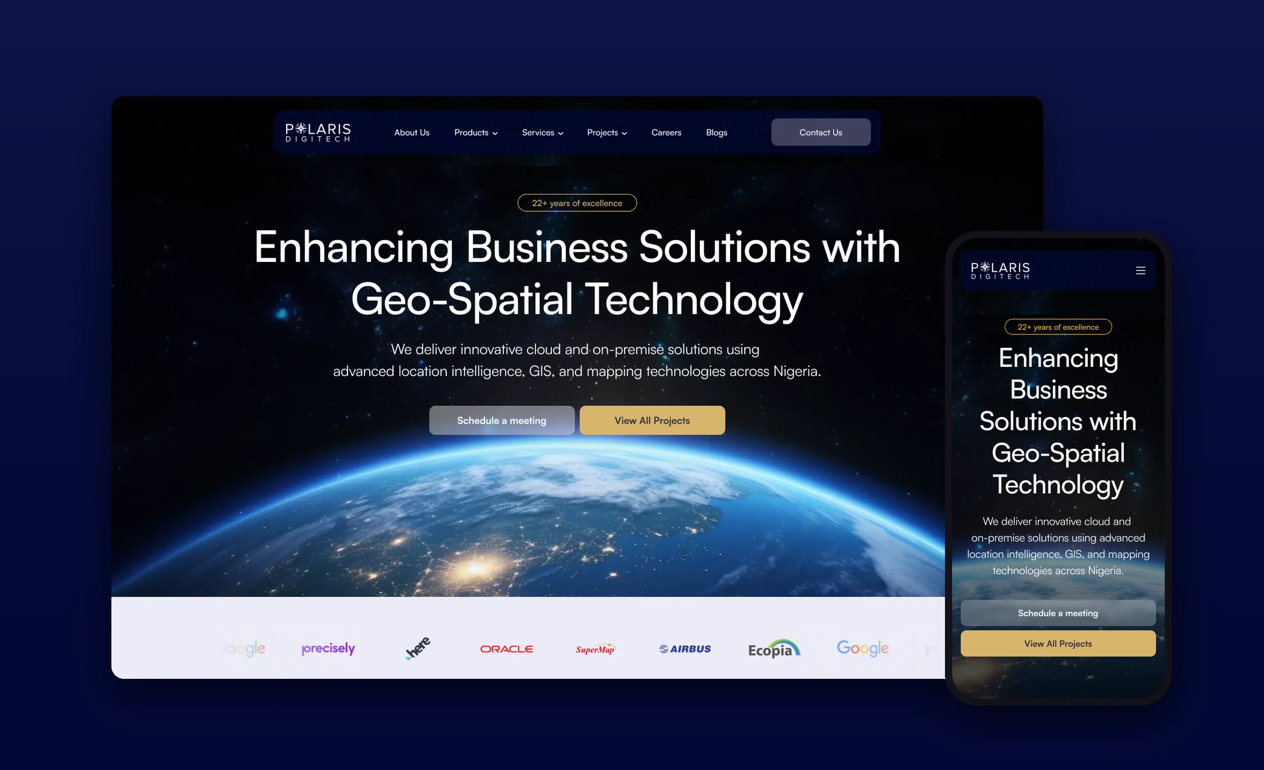
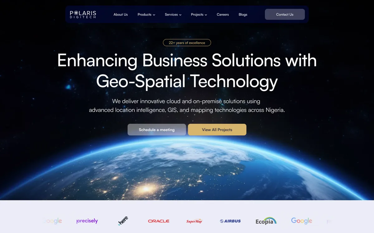
AfterA clearer headline over the earth at night, a “22+ years of excellence” badge, two actions (Schedule a meeting, View all projects) and partner logos right below.
Who PDL is
BeforeTwo justified paragraphs under “Who we are?”.
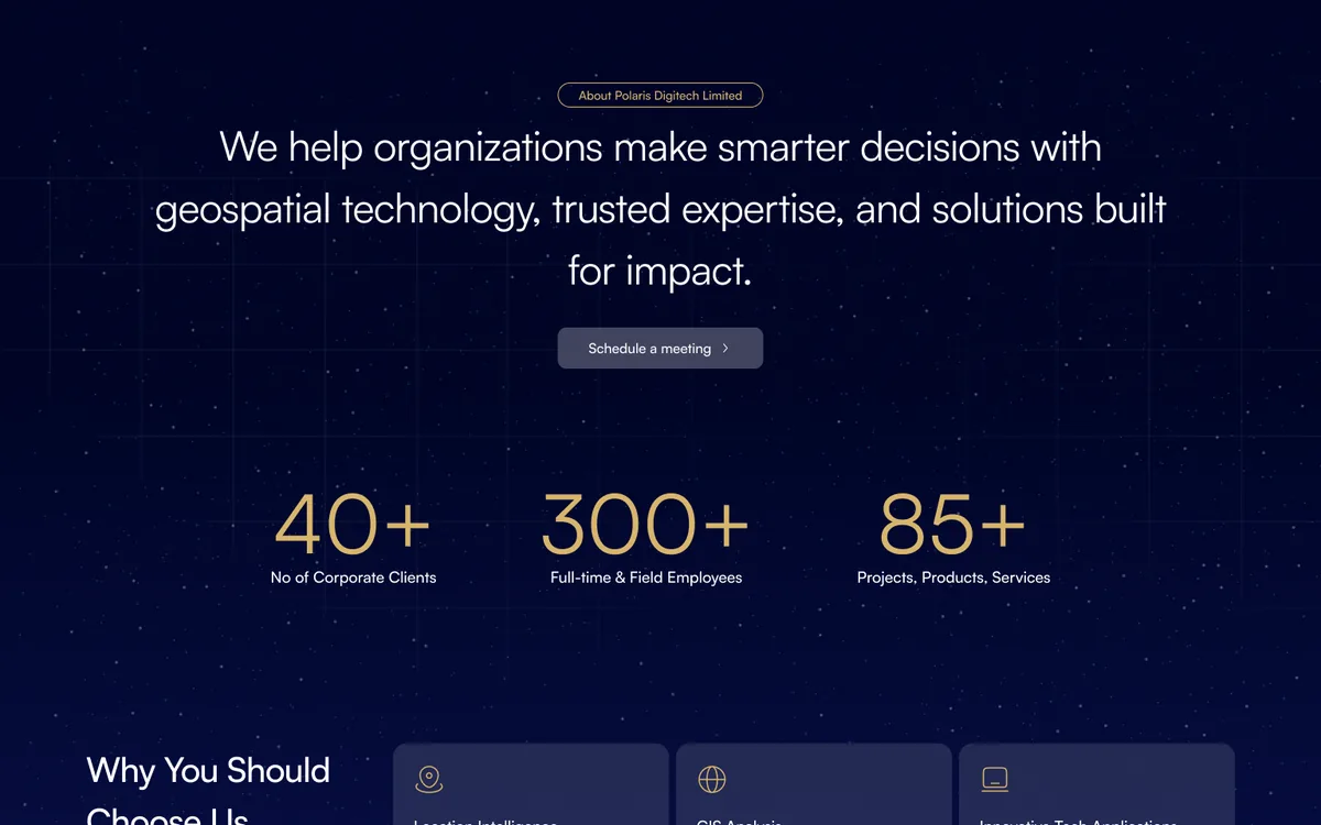
AfterOne sentence on what PDL does, then three numbers: 40+ corporate clients, 300+ full-time and field employees, 85+ projects, products and services. Three short reasons to choose PDL follow.
What PDL offers
BeforeProducts in four narrow navy cards with small text, and services in five identical rows.
AfterServices became a row of photo cards. Products became tinted cards with an icon, one line of description and a link.
Proof of work
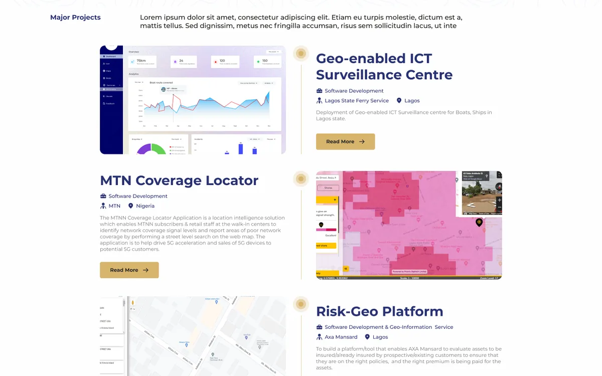
BeforeLorem ipsum introduced four projects in a timeline where every project looked the same.
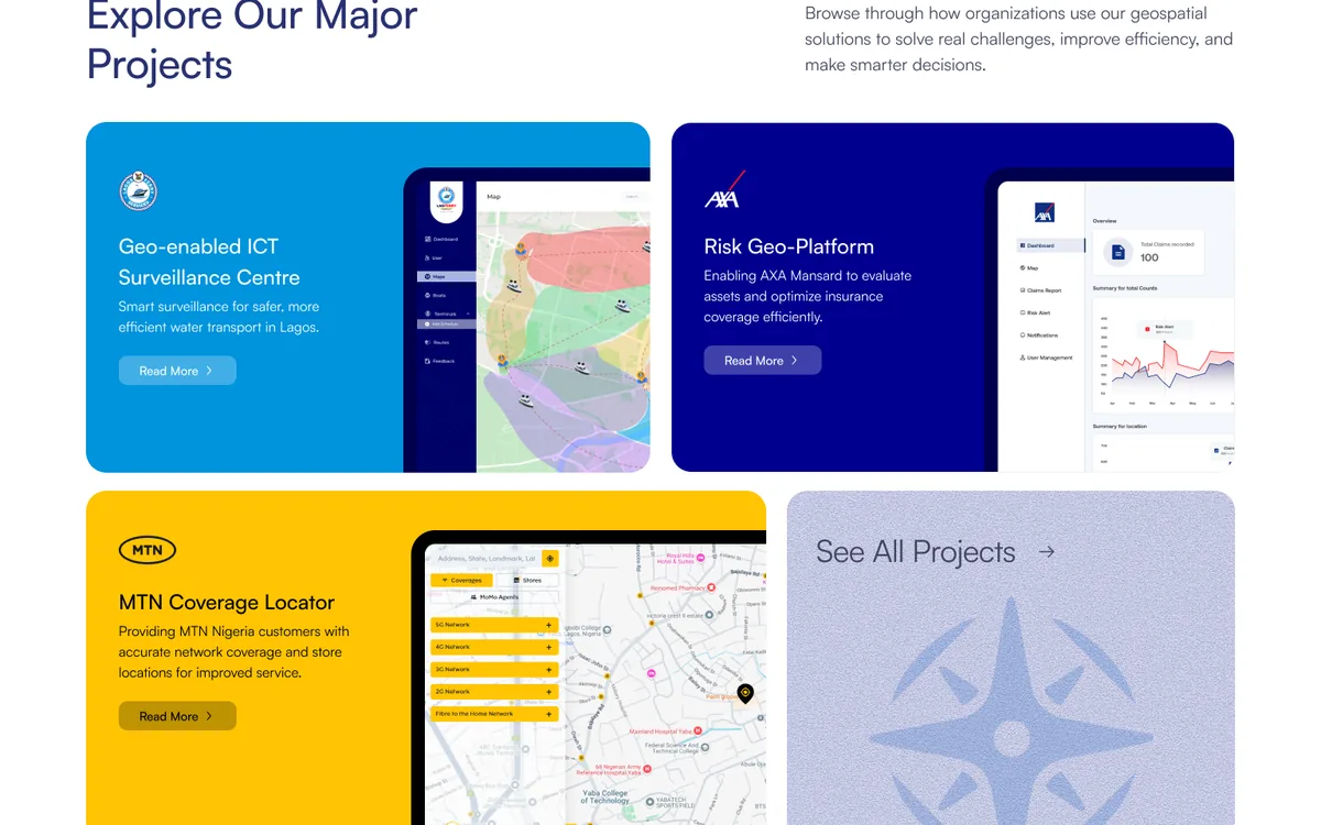
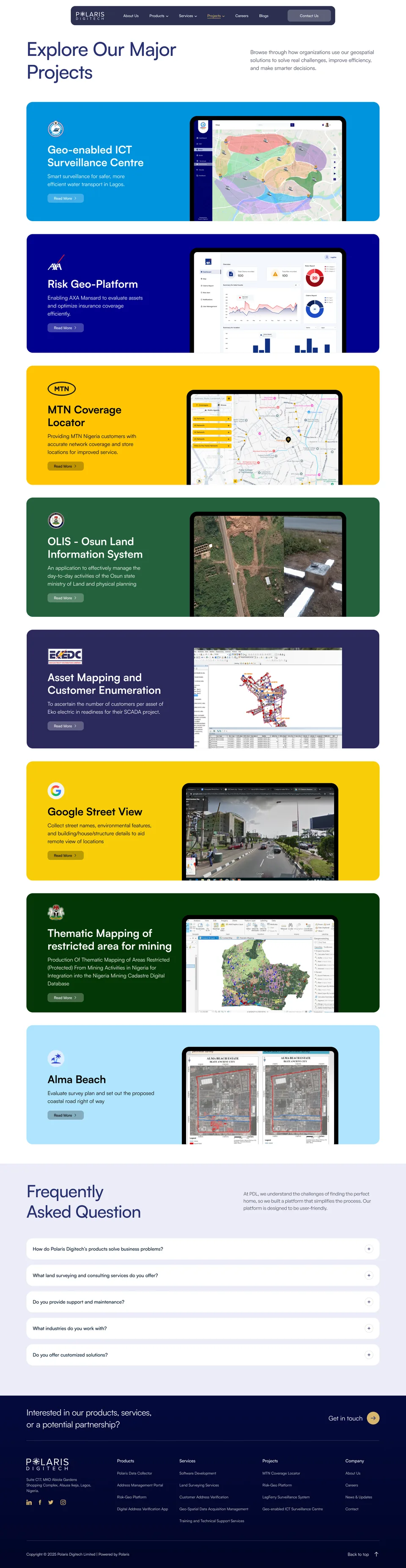
AfterLarge project cards in each client’s brand colour, with a screen from the product, so visitors recognise MTN, AXA or Lagos State before they read a word.
(06)Projects
Letting each project look like itself.
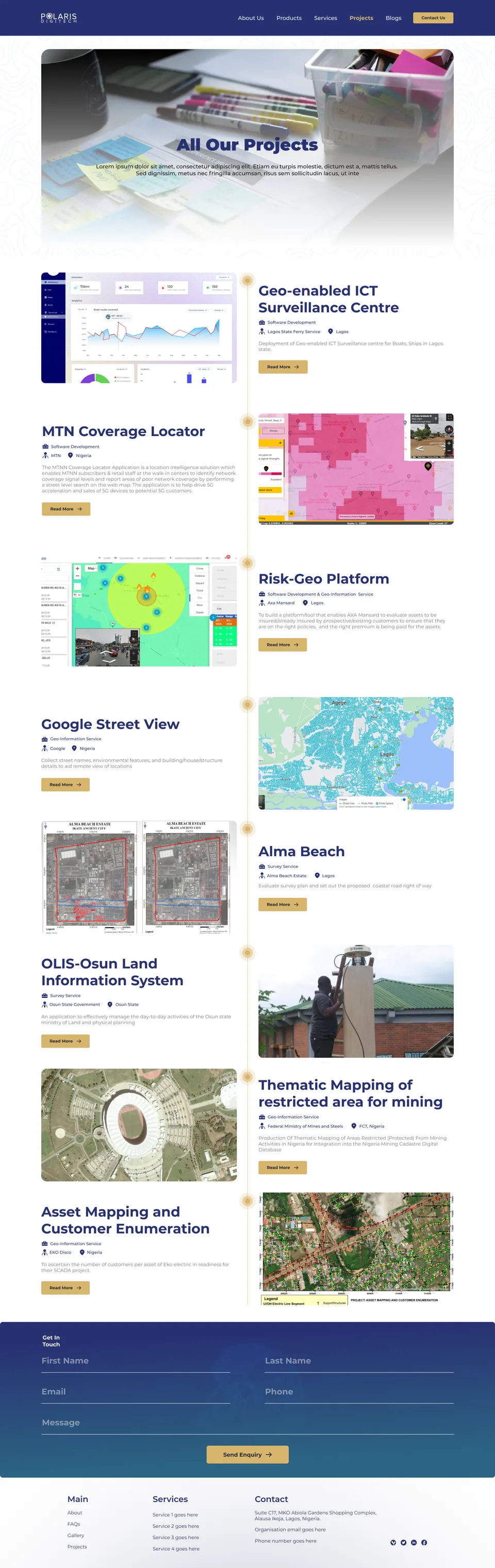
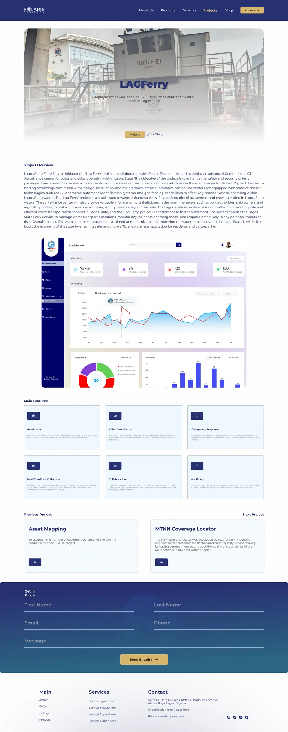
On the old Projects page every project had the same layout and the same gold dot, so nothing stood out. Each project page was one 300-word paragraph and a dashboard image. I gave each project card its client’s colour and a screen from the real product, and split project pages into short sections a client can scan.
Hover over a page to scroll through it.
01HeroProject name and one line on what was built, over a site photo
02Key factsIndustry, service, year and website
03DescriptionWhat PDL built and for whom, with web and mobile screens
04ObjectiveThe goal of the project in one sentence
05FeaturesSix key features in cards, then photos from the field

(07)Mobile
A dedicated mobile layout for every page.
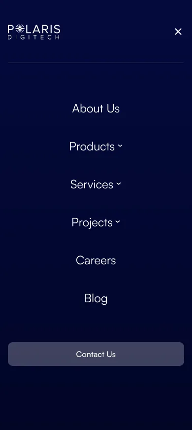
Every page has its own mobile design. The menu opens as a full-screen list, cards stack into one column, numbers stay large, and the main actions span the screen so they are easy to tap.




Hover over a screen to scroll through it.
(08)Design system
A calmer, more confident visual language.
The old site used Montserrat Black and gold on bright blue. I kept the Polaris blue and gold from the brand, added a deep navy for dark sections and a soft tint for each product, and moved to Satoshi for a lighter, more modern feel.
Polaris blue#283172
Action navy#0B1353
Deep navy#040937
Polaris gold#D7B56D
Label amber#D08F04
Body text#46485F
Muted text#6F7286
Surface#EBECF6
Satoshi
Display · 96 Regular40+
Section · 48 MediumSolutions You Can Rely On.
Lead · 20 RegularWe provide geospatial solutions that help businesses make informed decisions.
Card title · 18 MediumPolaris Data Collector (PDC)
Label · 14 MediumOur Products
One soft colour per product.
Polaris Data Collector#F0E2FF
Google Workspace#FFF2D7
Address Management Portal#CCECFF
Risk Geo-Platform#DAE4FF
Each in-house product keeps the same tint on the homepage, in the Products menu and on its own page, so visitors learn to recognise it.
Components
Navigation bar
P✱LARISDIGITECHAbout UsProducts Services Projects CareersBlogContact Us
Buttons
FAQ row
See All Products View All ProjectsRead More
Section labels
Our ProductsOur Services
Stats on deep navy
40+No of Corporate Clients
300+Full-time & Field Employees
85+Projects, Products, Services
What industries do you work with?+
Product cards
Project cards · client colour
Job card & filters
Polaris Data Collector (PDC)
A digital tool for real-time data gathering using custom forms.
Address Management Portal
Streamlines address verification and management.
AXA MansardRisk Geo-PlatformRead More
MTN NigeriaMTN Coverage LocatorRead More
All 6Engineering 2Product 2
Senior Product Manager
We are seeking a highly motivated and experienced Senior Product Manager…
Full-time • On-site • LagosRead More
(09)Reflection
What this redesign taught me.
Redesign the content, not just the look.
Most of the old site’s problems were content problems: placeholder text, long paragraphs and proof hidden in small logos. Changing the order of sections and rewriting the words did as much for the site as the new visual style.
Let the clients’ brands do some of the work.
Using each client’s colours on the project cards made PDL’s experience visible at a glance. It also gave a long page variety without needing new illustrations.
What I would do next
Measure what visitors do
The site has just launched. Track meetings scheduled, project page visits and job applications, so future changes are based on what people actually use.
Test the menus
Run a quick tree test to confirm people can find a specific service or project from the new menus.
Keep the proof current
Agree a routine with PDL for adding new projects, clients and jobs, so the site keeps showing recent work.